Overview
The Sticky add to cart section shows a bar along the bottom of the product page once the product’s buy buttons have scrolled out of view. The bar keeps Add to cart within reach while customers read the description, reviews and related products, which can help conversions. On desktop it shows:
- the product image, title and price
- the variant selectors (for example Beige, S, Chiffon)
- the quantity selector
- the Add to cart button
On phones it shows only the quantity selector and the Add to cart button, to save space. Choosing a variant in the bar updates the price and the selected product, just like the main product form.
How to use
- Go to Online Store → Themes → Customize.
- From the page selector at the top, choose Products → Default product.
- Click Add section → Sticky add to cart, or select an existing one.
- Choose whether to show the bar on desktop and on mobile.
- Under Content, choose what the bar shows: the image, variant selectors, quantity selector and button icon.
- Choose the Color scheme, Section width and Padding.
- Click Save, then scroll down the product page in the preview to see the bar.
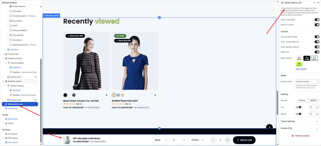
Settings
| Settings | Description |
|---|---|
| Show on Desktop | Show the sticky bar on desktop. |
| Show on Mobile | Show the sticky bar on phones. On phones it shows the quantity selector and the add to cart button. |
| Show Product Image | Show a small product image at the start of the bar. |
| Show Variant Selectors | Show dropdowns for the product options, such as color and size, so customers can change the variant from the bar. |
| Show Quantity Selector | Show the – / + quantity selector. |
| Show Icon | Show the arrow icon on the Add to cart button. |
| Color Scheme | Select a predefined color scheme for the bar. |
| Section Width | Set how wide the bar’s content is: Same as theme, Full width, Wide, Standard, Narrow or Custom. This overrides the theme Content width for this section only. |
| Custom Section Width | Appears when Section width is Custom. Set an exact width (600–2000 px). |
| Padding | Choose Desktop or Mobile under Devices, then adjust the Top and Bottom spacing inside the bar for that device (0–40 px). |
Note: The bar appears only after the product’s main Buy buttons scroll out of view, and hides again when they are back on screen. In the theme editor, scroll down the preview to see it.
Tip: Choose a color scheme that stands out from the page background, for example a white bar on a light grey page, so customers notice it. Sold-out products show a disabled Sold out button in the bar.