Overview
The Product tabs section shows product information in tabs on the product page, for example Description, Information, Shipping & return and Review (2). Customers click a tab to switch content, which keeps long information tidy and easy to scan. Each tab can show:
- the product description
- your own text
- the content of a page (useful for shipping or return policies shared across all products)
- Specification rows, Text, Custom Liquid or a reviews app block
You can style the tab bar and the content panel with separate color schemes, and add up to 8 tabs.
How to use
- Go to Online Store → Themes → Customize.
- From the page selector at the top, choose Products → Default product.
- Click Add section → Product tabs, or select an existing one.
- Optionally, enter a Heading. Then set the Tab alignment, Show tab icons and Corner radius.
- Choose the Tab bar colors and Panel colors.
- Click Add block → Tab for each tab, then set its label, icon and content.
- Set the Section width and Padding.
- Click Save.
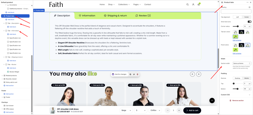
Settings
Settings Description Heading Enter an optional heading shown above the tabs, for example Product details. Leave it empty to hide it. Tab Alignment Align the tabs Left or Center in the tab bar. Show Tab Icons Show an icon before each tab label. Corner Radius Customize the rounded corners of the tab bar and panel (0–32 px). Tab Bar Colors Select a predefined color scheme for the tab bar. Panel Colors Select a predefined color scheme for the content panel below the tabs. Section Width Set how wide the section is: Same as theme, Full width, Wide, Standard, Narrow or Custom. This overrides the theme Content width for this section only. Custom Section Width Appears when Section width is Custom. Set an exact width (600–2000 px). Padding Choose Desktop or Mobile under Devices, then adjust the Top and Bottom spacing of the section for that device. Tip: If you use Product tabs for the description, remove the description from the product information area (for example, the Accordions block), so it isn’t shown twice.
Tab Block
Overview
A Tab block is one tab, with a label, an icon and its content. Choose what the tab shows: the product description, custom text, a page, or only the blocks you add inside it. Blocks inside a tab, such as Specification rows, Text, Custom Liquid or a reviews app block, show under the main content.
How to use
- Expand Product tabs, then select a Tab, or click Add block → Tab.
- Enter the Tab label and choose an Icon.
- For a reviews tab, set Count after the label to Reviews.
- Under Content, choose what to Show. Then enter the Text or select a Page if needed.
- Click Add block inside the tab to add Specification rows, Text, Custom Liquid or an app block.
- Click Save.
Settings
| Settings | Description |
|---|---|
| Tab Label | Enter the tab label, for example Description or Shipping & return. |
| Icon | Show an icon before the label: None, Pen, Info, T-shirt, Hanger, Ruler, Box, Delivery, Truck, Return, Shield, Washing, Leaf, Message, Chat, Star or Question. Icons show when Show tab icons is on in the section. |
| Count After the Label | Show a number after the label: None or Reviews, for example Review (2). Reviews reads the reviews.rating_count metafield that your reviews app writes. |
| Show | Choose the tab content: Product description, Custom text, Page or Blocks only. |
| Text | Used when Show is set to Custom text. Enter the text for this tab. It’s the same on every product that uses this template. |
| Page | Used when Show is set to Page. Select a page to show its content, for example your Shipping & returns page. Edit it once in Online Store → Pages, and every product updates. |
Reviews tab: Set Show to Blocks only, then click Add block inside the tab and choose your reviews app’s block (for example Review Widget) under Apps. This works with Judge.me and other review apps that offer an app block.
Specification Row Block
Overview
A Specification row shows one product detail as a label and value, for example Fabric: Chiffon or Fit: Regular. Add several rows inside a tab to build a specification table. Connect each value to a product metafield, so every product shows its own details automatically. Rows with no value are hidden.
How to use
- Expand a Tab (for example Information) and click Add block → Specification row.
- Enter the Label, for example Fabric:.
- Enter the Value, or click the Connect dynamic source icon next to Value and choose a product metafield.
- Repeat for each detail.
- Click Save.
Settings
| Settings | Description |
|---|---|
| Label | Enter the name of the detail, for example Fabric:, Fit: or Care:. |
| Value | Enter the value, or connect it to a product metafield with the dynamic source button. Rows with no value are hidden, so products without that detail don’t show an empty row. |
Setting up metafields: Go to Shopify admin → Settings → Custom data → Products → Add definition. Create a definition for each detail, for example Fabric (Single line text). Fill it in on each product, then connect it to the Specification row’s Value. See the Metafields and Custom Data article.
Blocks: Text and Custom Liquid can also be added inside a tab. See their articles for settings.