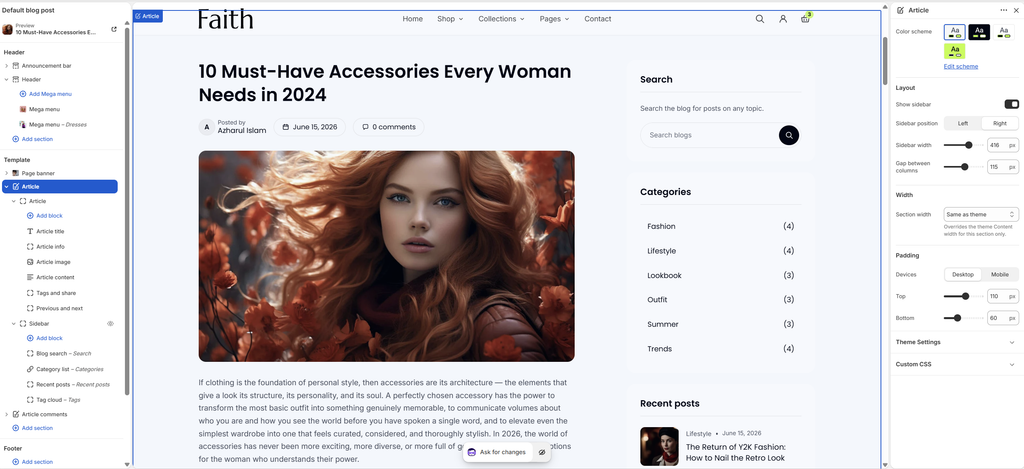
The Article section is the main part of every blog post page. On the left, the Article block shows the post: title, author, date, comment count, featured image, content, tags, share buttons, and links to the previous and next posts. On the right, an optional Sidebar holds widgets: blog search, categories, recent posts and a tag cloud. Below, the Article comments section shows the comment form and approved comments. The Article and Sidebar blocks are part of the section and cannot be removed.
How to use
Go to Online Store → Themes → Customize.
From the page selector at the top, choose Blog posts → Default blog post.
Select Article, and set the Color scheme and layout.
Expand Article to edit the post blocks, and Sidebar to edit the widgets.
Set the Section width and Padding.
Click Save.
Settings
Settings
Description
Color Scheme
Select a predefined color scheme for the section.
Show Sidebar
Show the sidebar beside the post. Turn it off for a single, centered reading column.
Sidebar Position
Appears when Show sidebar is on. Place the sidebar on the Left or Right.
Sidebar Width
Appears when Show sidebar is on. Set the sidebar width (260–500 px).
Gap Between Columns
Appears when Show sidebar is on. Adjust the space between the post and the sidebar (20–200 px).
Section Width
Set how wide the section is: Same as theme, Full width, Wide, Standard, Narrow or Custom. This overrides the theme Content width for this section only.
Custom Section Width
Appears when Section width is Custom. Set an exact width (600–2000 px).
Padding
Choose Desktop or Mobile under Devices, then adjust the Top and Bottom spacing of the section for that device.
Page banner: The banner above the post is the Page banner section. See the Page Banner article for its settings.
Article Block
Overview
The Article block holds the blog post content. Its inner blocks can be reordered, hidden or removed, and you can add Heading, Text, Button, Image and Custom Liquid blocks, for example a newsletter sign-up message at the end of every post. This block is part of the section and cannot be removed.
How to use
Expand Article and select the Article block.
Set the Space between blocks.
Click each inner block to edit it, drag blocks to reorder them, or click Add block to add more.
Click Save.
Settings
Settings
Description
Space Between Blocks
Adjust the vertical space between the blocks in the post (0–80 px).
Article Title
Settings
Description
Level
Choose the title’s heading tag: H1 or H2. Keep H1 unless the Page banner already shows the post title as H1. Each page should have one H1 for SEO.
Font Size
Set the title size on desktop (20–80 px).
Font Size on Mobile
Set the title size on mobile (18–60 px).
Article Info
Settings
Description
Show Author
Show the author, for example Posted by Azharul Islam.
Show Author Image
Appears when Show author is on. Show the profile image from the author’s staff account. Without one, the author’s first initial shows.
Show Date
Show the publish date.
Show Comment Count
Show the number of comments, for example 0 comments. Clicking it scrolls to the comments.
Article Image
Settings
Description
Aspect Ratio
Choose the featured image shape: Adapt to image, Landscape (3:2), Wide (16:9) or Square.
Corner Radius
Customize the rounded corners of the image (0–40 px).
Article Content
Settings
Description
Quote Color Scheme
Choose the background color scheme for quotes in the post. Add quotes in the blog post editor with the Quote format.
Tags and Share
Settings
Description
Show Tags
Show the post’s tags. Each tag links to all posts with that tag.
Show Share Buttons
Show share buttons. Choose the networks in Theme settings → Social media.
Previous and Next
Settings
Description
Show Images
Show the featured images of the previous and next posts in the links at the end of the post.
Tip: To add the same message to every post, for example Shop the look with a button, add a Text and Button block after Article content.
Sidebar Block
Overview
The Sidebar block holds widgets beside the post: Blog search, Category list, Recent posts and Tag cloud. You can also add Heading, Text and Custom Liquid blocks, for example a promo or newsletter message. The sidebar shows only when Show sidebar is on in the Article section. On mobile, it moves below the post.
How to use
Expand Article and select Sidebar.
Set the widget spacing, colors, corner radius and padding.
Turn Enable sticky on desktop on or off.
Click each widget to edit it, drag them to reorder, or click Add block to add more.
Click Save.
Settings
Settings
Description
Space Between Widgets
Adjust the space between widgets (0–100 px).
Widget Color Scheme
Select a predefined color scheme for the widget cards.
Corner Radius
Customize the rounded corners of the widgets (0–40 px).
Widget Padding
Adjust the space inside each widget on desktop (0–60 px).
Widget Padding on Mobile
Adjust the space inside each widget on mobile (0–60 px).
Enable Sticky on Desktop
Keep the sidebar in view while readers scroll a long post on desktop.
Blog Search
Settings
Description
Heading
Enter the widget heading, for example Search.
Text
Enter a short line under the heading, for example Search the blog for posts on any topic.
Note
The search box searches blog posts only, not products.
Category List
Settings
Description
Heading
Enter the widget heading, for example Categories.
Menu
Select a menu to list your own links. Leave it empty to list the blog’s tags as categories.
Show Post Counts
Show the number of posts next to each tag, for example Fashion (4). Applies when the list shows tags.
Recent Posts
Settings
Description
Heading
Enter the widget heading, for example Recent posts.
Number of Posts
Set how many recent posts are listed (1–10).
Show Image
Show a small featured image for each post.
Show Tag
Show each post’s first tag.
Show Date
Show each post’s publish date.
Tag Cloud
Settings
Description
Heading
Enter the widget heading, for example Tags.
Highlight the Post’s Own Tags
Highlight the tags that belong to the post being read.
Tip: Use tags as categories, for example Fashion, Lifestyle, Lookbook, Trends. Keep a small, consistent set, so the Category list and Tag cloud stay tidy.
Article Comments Section
Overview
The Article comments section shows a form for readers to leave a comment, and the list of approved comments. It appears only when comments are turned on for the blog in Shopify admin. The form and the list are part of the section and cannot be removed.
How to use
Go to Shopify admin → Content → Blog posts → Manage blogs, and open your blog.
Under Comments, choose Comments are allowed, pending moderation or Comments are allowed, and click Save.
In the theme editor, open Blog posts → Default blog post, and select Article comments.
Set the Color scheme, Form position and Gap between columns.
Expand it to edit the Comment form and Comment list.
Click Save.
To approve comments, go to Shopify admin → Content → Blog posts, open the post, and review its comments.
Settings
Settings
Description
Color Scheme
Select a predefined color scheme for the comments section.
Form Position
Place the comment form on the Left or Right of the comment list.
Gap Between Columns
Adjust the space between the form and the list (20–200 px).
Section Width
Set how wide the section is: Same as theme, Full width, Wide, Standard, Narrow or Custom.
Custom Section Width
Appears when Section width is Custom. Set an exact width (600–2000 px).
Padding
Choose Desktop or Mobile under Devices, then adjust the Top and Bottom spacing of the section for that device.
Comment Form
Settings
Description
Heading
Enter the form heading, for example Leave a comment.
Separate First and Last Name
Show separate first and last name fields, instead of one name field.
Show “Save My Information”
Show a checkbox that remembers the reader’s name and email in their browser for next time.
Label
Enter the submit button text, for example Post comment.
Comment List
Settings
Description
Heading
Enter the list heading, for example Comments.
Show Count After Heading
Show the number of comments after the heading, for example Comments (3).
Comments Per Page
Set how many comments show per page (2–20). Page numbers appear when there are more.
Moderation: With Comments are allowed, pending moderation, new comments appear only after you approve them, and readers see a message saying so after posting. This is the safer option, because it keeps spam off your store.