
Before you start:
- From your Shopify admin, go to Online Store > Themes.
- Next to the theme you want to edit, click Customize.
- In the section list, click Footer to open its settings.
Everything below applies inside this Footer section.
Newsletter Subscription
At the top of the footer, a newsletter subscription section encourages users to subscribe using their email address to receive updates, promotions, and discount offers. The subscription form includes:
- Email input field
- Subscribe button
- Privacy & Terms notice
This section helps improve customer retention and email marketing engagement.
Newsletter Block Settings
The newsletter block is used to collect customer email subscriptions.
Heading
Controls the newsletter title text.
Example:
Subscribe our newsletter to receive updates about discounts
Heading Size
Available heading sizes:
- H1
- H2
- H3
- H4
- H5
Rich Text
Allows adding additional text such as:
- Privacy Policy notice
- Terms of Use information
- Promotional descriptions
Text Style
Supports:
- Body
- Subtitle
Text Size
Controls the newsletter description text size.
Button Style
Available styles:
- Primary
- Secondary
Button Type
Controls button appearance:
- With icon and text
- None
Newsletter Appearance Settings
Inherit Color Scheme
Uses the parent footer color scheme automatically.
Corner Radius
Controls border radius of the newsletter form elements.
Newsletter Padding
Controls the space (in pixels) between the newsletter block’s border and its content, on each side independently:
Left / Right — horizontal spacing on either side of the content
Top / Bottom — vertical spacing above and below the content
Color scheme
| Settings | Description |
| Color scheme | You can change the color of the footer. The color scheme is based on your theme’s Color Settings. |
Footer Section Settings
Background Image
Allows uploading a custom background image for the footer section to enhance branding and visual appearance.
Media Overlay
Adds a dark overlay above the background image to improve text readability.
Layout Width
Controls the overall width of the footer section.
Available options:
- Page Width
- Full Width
Color Scheme
Selects the predefined color scheme used for the footer background, text, buttons, and links.
Section padding settings
| Settings | Description |
| Desktop: Padding top | The section’s top inner space height, from 0 to 200px in 2px increments. Affects desktop only. |
| Desktop: Padding bottom | The section’s bottom inner space height, from 0 to 200px in 2px increments. Affects desktop only. |
| Tablet: Padding top | The section’s top inner space height, from 0 to 200px in 2px increments. Affects tablet only. |
| Tablet: Padding bottom | The section’s bottom inner space height, from 0 to 200px in 2px increments. Affects tablet only. |
| Mobile: Padding top | The section’s top inner space height, from 0 to 200px in 2px increments. Affects mobile only. |
| Mobile: Padding bottom | The section’s bottom inner space height, from 0 to 200px in 2px increments. Affects mobile only. |
Footer Navigation
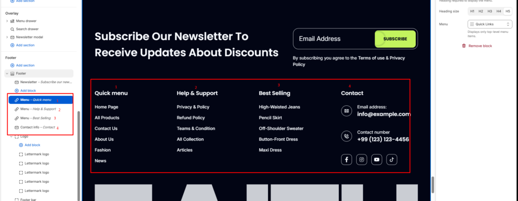
The main footer area is organized into four columns:
Quick Menu
Contains important store navigation links such as:
- Home Page
- All Products
- Contact Us
- About Us
- Fashion
- News
Help and Support
Provides access to customer support and policy-related pages:
- Privacy Policy
- Refund Policy
- Terms and Conditions
- Collections
- Articles
Best Selling
Highlights featured or trending products to improve product discoverability and conversions.
Contact Information
Displays business contact details including:
- Email address
- Phone number
- Social media icons (Facebook, Instagram, YouTube, TikTok)
Menu Block Settings
The menu block displays navigation links inside the footer.
Heading
Controls menu title.
Example:
- Quick Menu
- Help and Support
- Best Selling
Heading Size
Available options:
- H1
- H2
- H3
- H4
- H5
Typography Branding
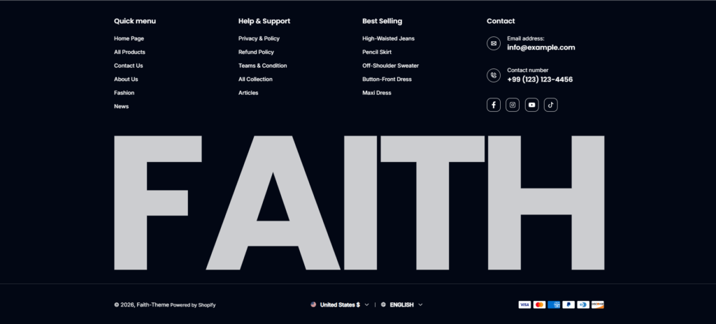
A large background typography element (“FAITH”) is used as a visual branding component to create a bold and premium aesthetic appearance.
Lettermark Logo
The Lettermark Logo block lets you add individual SVG letters or shapes that together create a large branded typography design.
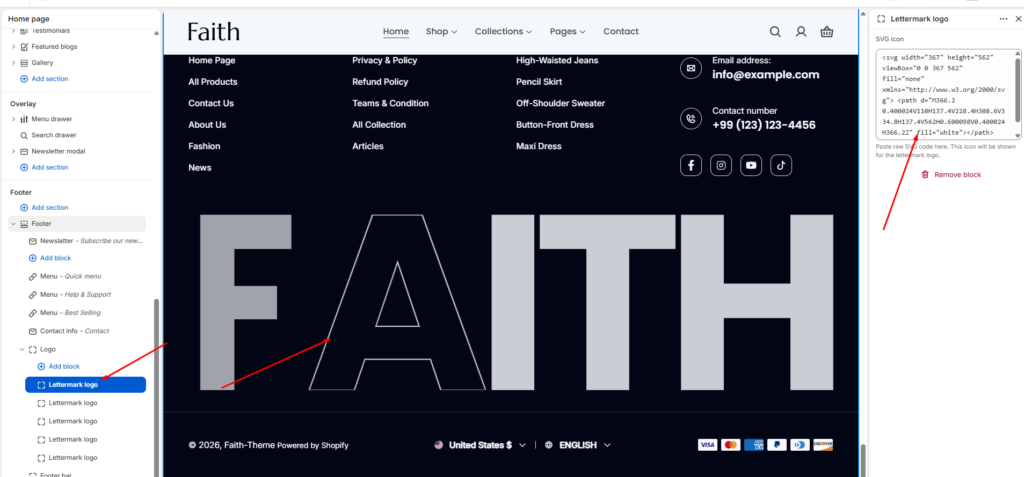
The Logo block is used to create the large decorative branding typography displayed inside the footer section. This feature allows merchants to build fully custom oversized footer branding using SVG-based lettermark logos.
SVG Icon
Paste custom SVG code directly into the SVG field. Each block represents a single letter or graphic element.
Example uses:
- Brand initials
- Large typography branding
- Decorative footer graphics
- Custom vector-based shapes
Multiple Logo Blocks
Multiple Lettermark Logo blocks can be added to create complete words or custom footer compositions.
Example:
- F
- A
- I
- T
- H
These individual SVG blocks combine visually to create the large “FAITH” branding typography shown in the footer.
Responsive SVG Rendering
All SVG elements scale responsively and remain sharp on all screen sizes and retina displays.
Custom Branding Layout
The logo blocks help create a premium and modern footer appearance by combining oversized typography with navigation and contact information.
Add / Remove Blocks
- Add Block → Adds a new SVG letter or shape
- Remove Block → Deletes the selected logo element
This system provides full flexibility for creating unique footer branding designs inside the Shopify theme editor.
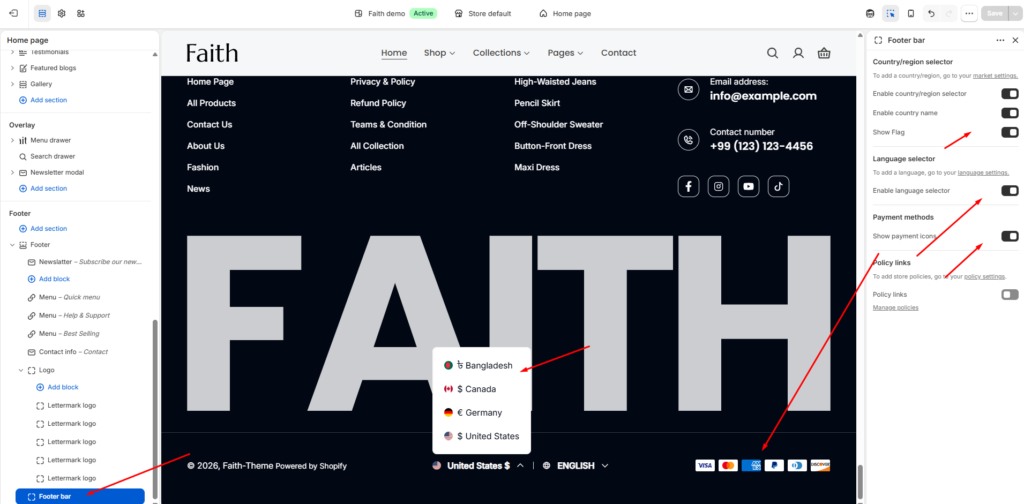
Bottom Footer Bar
The bottom section includes:
- Copyright information
- Country and language selector
- Supported payment method icons
This area provides localization support and builds trust through payment gateway visibility.
Design Features
- Dark premium color scheme
- Responsive multi-column layout
- Large typography branding
- Rounded newsletter input design
- Social media integration
- Mobile-friendly structure
- Clean spacing and visual hierarchy
This footer is fully optimized for modern Shopify fashion and lifestyle stores, combining branding, navigation, customer support, and conversion-focused elements in a single section.
Country/Region Selector (Multi-Currency)
| Settings | Description |
| Enable country/region selector | Shows a country/region picker in the footer, letting customers switch to see localized pricing and language where you’ve set up Shopify Markets. NOTE: Country/region options are managed under Settings > Markets, not in the theme editor. |
Setting Up Payment Methods
The footer’s payment icons pull directly from your store’s active payment providers — there’s nothing to configure here beyond making sure payments are set up in Shopify itself.
- From your Shopify admin, go to Settings > Payments.
- In the Shopify Payments section, click Manage.
- Add or confirm your payment providers.
Read Shopify’s payment setup guide →
Show payment icons on Shopify
| Settings | Description |
| Show payment icons | If you enable it, the payment icon will appear in the footer. Warning: You need to set up payment methods in your store. |
Troubleshooting:
Payment icons not showing? Confirm at least one payment provider is active under Settings > Payments — the footer only displays icons for providers you’ve enabled.
Newsletter form not appearing? Check that the Newsletter block hasn’t been hidden or removed from the Footer section in Customize.
Country/region selector not showing options? Confirm you’ve added regions under Settings > Markets — this control only displays regions you’ve already configured there.
Changes not showing on your store? Make sure you’re editing the theme currently published as your live theme, not a draft or duplicate.