Overview
The Gallery section shows a scrolling row of image and video tiles, ideal for an Instagram-style feed or customer photos, for example Instagram Gallery. Each tile can be linked to a product, so shoppers see the price and title on hover and can click through to buy. The section works as a carousel, with optional dots, slide counter, progress bar and auto-rotation.
How to use
- Go to Online Store → Themes → Customize.
- Click Add section → Gallery, or select an existing Gallery section.
- Edit the Section heading to change the title and subtitle, for example Instagram [Gallery].
- Click Add block and choose Gallery image or Gallery video for each tile.
- Under Tiles, set the number of columns for desktop, tablet and mobile, and adjust the Tile height, Spacing and Corner radius.
- Under Hover, choose what shows when a customer hovers over a tile.
- Under Carousel, turn on dots, counter, progress bar, looping or auto-rotation as needed.
- Set the Section width and Padding.
- Click Save.
Settings
| Settings | Description |
|---|---|
| Color Scheme | Select a predefined color scheme for the section background and text. |
| Columns on Desktop | Set how many tiles show across on desktop (2–8). |
| Columns on Tablet | Set how many tiles show across on tablet (2–5). |
| Columns on Mobile | Set how many tiles show across on mobile: 1, 1.25, 1.5, 2 or 2.5. A value like 1.5 shows part of the next tile, so customers know they can swipe. |
| Tile Height | Set the tile height as a share of its width (50–180%). 100% is square, and higher values make taller tiles. |
| Spacing | Adjust the space between tiles on desktop (0–40 px). |
| Spacing on Mobile | Adjust the space between tiles on mobile (0–24 px). |
| Corner Radius | Customize the rounded corners of the tiles (0–40 px). |
| Show Product Info on Hover | Show the price, title and a View details link over the tile on hover. Tiles with no product chosen show sample info. |
| Show Icon | Show an icon over the tile on hover. |
| Hover Icon | Appears when Show icon is on. Choose Instagram, TikTok, Pinterest, Plus, Arrow or Eye. It shows at the top of the product panel, or alone over the tile. |
| Overlay Opacity | Adjust how dark the tile becomes on hover (0–80%). |
| Show Text | Choose when the hover content appears: On hover or Always. Touch screens always show it. |
| Gradient Start / Gradient End | Choose the two colors of the gradient on the video play button. |
| Show Dots | Show navigation dots under the carousel. |
| Show Slide Counter | Show the current position, for example 2 / 8. |
| Show Progress Bar | Show a bar that fills as the customer moves through the tiles. |
| Loop Slides | Go back to the first tile after the last one. |
| Auto-rotate Slides | Move to the next tile automatically. |
| Change Slides Every | Appears when Auto-rotate slides is on. Set how long each slide stays (3–10 seconds). |
| Pause on Hover | Appears when Auto-rotate slides is on. Stop auto-rotation while the customer’s mouse is over the gallery. |
| Section Width | Set how wide the section is. Options include Same as theme, Full width, Wide, Standard, Narrow and Custom. Full width runs the tiles to the edges of the screen. |
| Custom Section Width | Appears when Section Width is set to Custom. Set an exact width (600–2000 px). |
| Padding | Choose Desktop or Mobile under Devices, then adjust the Top and Bottom spacing of the section for that device. |
Tip: To show carousel arrows, select the Section heading block, set its Layout to Horizontal, and choose Carousel arrows under Show.
Gallery Image Block
Overview
The Gallery image block is a single image tile. Link it to a product to show that product’s price and title on hover, so the tile sends shoppers to the product page. You can also link the whole tile to any URL, such as an Instagram post.
How to use
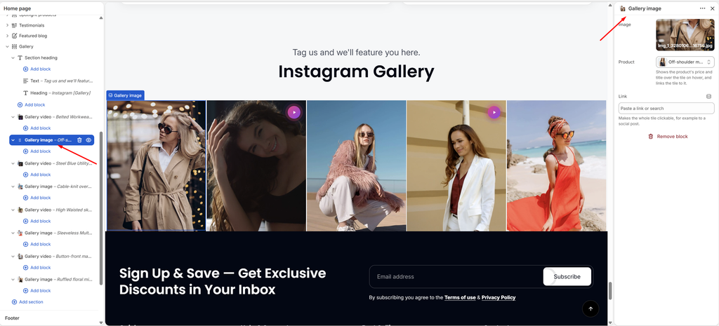
- Expand Gallery and click Add block → Gallery image, or select an existing one.
- Click Select under Image to upload or choose a picture.
- Choose a Product to show its details on hover, or add a Link to make the whole tile clickable.
- Turn on Open link in a new tab if the link goes to another website.
- Click Save.
Settings
| Settings | Description |
|---|---|
| Image | Upload or select the image for the tile. |
| Product | Choose a product to show its price and title over the tile on hover. The tile then links to that product. |
| Link | Make the whole tile clickable, for example to a social media post. |
| Open Link in a New Tab | Appears when a Link is added. Open the link in a new browser tab. |
Gallery Video Block
Overview
The Gallery video block is a video tile that plays inside the gallery. Use an uploaded video or a YouTube or Vimeo link. Like image tiles, it can be linked to a product, so shoppers can buy what they see.
How to use
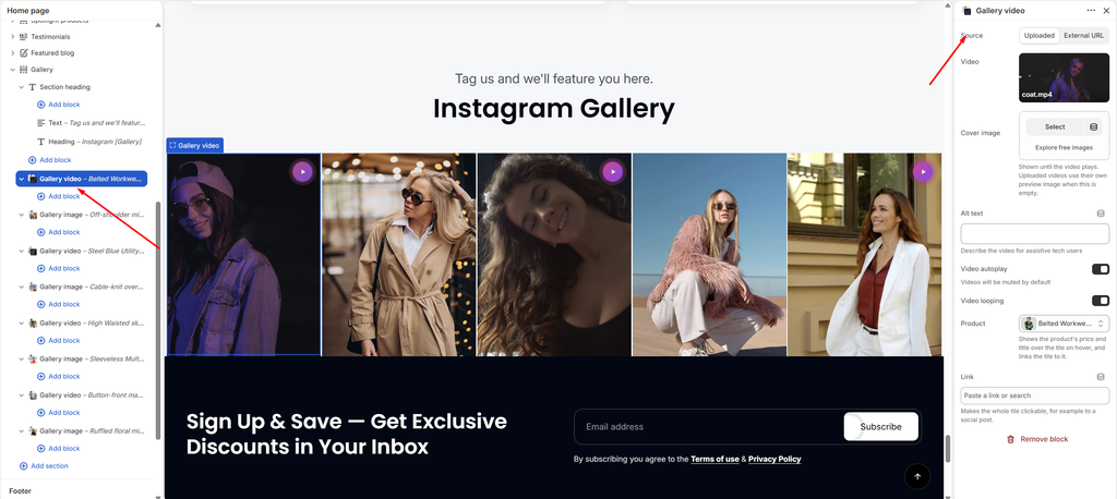
- Expand Gallery and click Add block → Gallery video, or select an existing one.
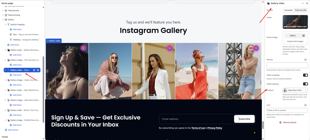
- Choose the Source: Uploaded to select a video from your Shopify files, or External URL to paste a YouTube or Vimeo link.
- Add a Cover image (optional) and Alt text that describes the video.
- Turn Video autoplay and Video looping on or off.
- Choose a Product to show its details on hover, or add a Link.
- Click Save.
Settings
| Settings | Description |
|---|---|
| Source | Choose where the video comes from: Uploaded (a video in your Shopify files) or External URL (YouTube or Vimeo). |
| Video | Appears when Source is Uploaded. Select the video file. |
| Video URL | Appears when Source is External URL. Paste a YouTube or Vimeo link. |
| Cover Image | Shown until the video plays. Uploaded videos use their own preview image when this is empty. |
| Alt Text | Describe the video for customers who use screen readers. |
| Video Autoplay | Play the video automatically. Autoplaying videos are muted by default. |
| Video Looping | Restart the video when it ends. |
| Product | Choose a product to show its price and title over the tile on hover. The tile then links to that product. |
| Link | Make the whole tile clickable, for example to a social media post. |
| Open Link in a New Tab | Appears when a Link is added. Open the link in a new browser tab. |
Section heading: The title and subtitle are set in the Section heading block. See the Section Heading article.