Overview
The Collections list section is the main grid on your all collections page (yourstore.com/collections). It lists every collection in your store as a card, for example Accessories, Activewear and Best Seller. Each card shows:
- the collection image
- the number of products
- the starting price
- an arrow button
The list fills itself: new collections appear automatically, so you only set the layout and card style. When you have more collections than fit on one page, page numbers appear below the grid.
How to use
- Go to Online Store → Themes → Customize.
- From the page selector at the top, choose Collections list. (This page might also show as Collections.)
- Select Collections list.
- Choose the Color scheme and Collections per page.
- Under Layout, set the columns for desktop, tablet and mobile, and the gaps between them.
- Set the Section width and Padding.
- Select the Collection card block to style the cards.
- Click Save.
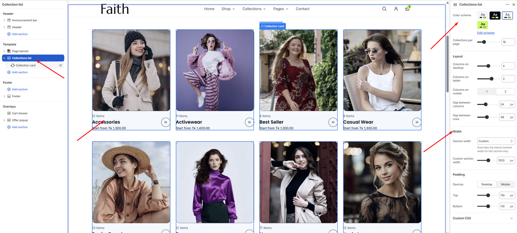
Settings
| Settings | Description |
|---|---|
| Color Scheme | Select a predefined color scheme for the section. |
| Collections Per Page | Set how many collections show on each page (4–48). Page numbers appear when there are more. |
| Columns on Desktop | Set how many cards show in each row on desktop (2–6). |
| Columns on Tablet | Set how many cards show in each row on tablet (1–4). |
| Columns on Mobile | Set how many cards show in each row on mobile: 1 or 2. |
| Gap Between Columns | Adjust the horizontal space between cards (0–60 px). |
| Gap Between Rows | Adjust the vertical space between rows of cards (0–100 px). |
| Section Width | Set how wide the section is: Same as theme, Full width, Wide, Standard, Narrow or Custom. This overrides the theme Content width for this section only. |
| Custom Section Width | Appears when Section width is Custom. Set an exact width (600–2000 px). |
| Padding | Choose Desktop or Mobile under Devices, then adjust the Top and Bottom spacing of the section for that device. |
Tip: Set Collections per page to a multiple of your desktop columns (for example 16 with 4 columns), so every row is full.
Note: This page shows all your collections. To show only a few selected collections, for example on the home page, use the Featured collection pills, Scrollable collections or Multi card section instead.
Collection Card Block
Overview
The Collection card block sets the style of every card in the list. Each card takes its image, title, product count and starting price from its collection automatically. This block is part of the section and cannot be removed.
How to use
- Expand Collections list and select Collection card.
- Choose the Aspect ratio and Corner radius.
- Choose which details to show: image border, product count, starting price and arrow button.
- Click Save.
- To change a card’s image, go to Shopify admin → Products → Collections, open the collection, and upload a Collection image.
Settings
| Settings | Description |
|---|---|
| Aspect Ratio | Choose the image shape: Card (342:357), Square, Portrait (4:5), Landscape (3:2) or Adapt to image. |
| Corner Radius | Customize the rounded corners of the image (0–40 px). |
| Show Image Border | Add a thin border around the image. |
| Show Product Count | Show how many products are in the collection, for example 12 items. |
| Show Starting Price | Show the lowest product price in the collection, for example Start from Tk 1,300.00. |
| Show Arrow Button | Show a round arrow button next to the title. |
Tip: Give every collection an image of the same shape and size, at least 800 × 800 px, so the grid looks even. Collections without an image show a placeholder.