Overview
The Image card block shows an image that fills the card, with your content placed on top of it. You can add a color overlay so text stays readable, show a short label in the top-left corner, and add blocks such as a heading, text and button over the image. Use it for promo tiles, category highlights or editorial cards.
You can add these blocks inside an Image card: Heading, Text, Button, Icon, Icon box, Rating, Divider, Spacer, Group and Custom Liquid.
How to use
- In the theme editor, open the section or Group where you want the card.
- Click Add block and select Image card.
- Click Select image to upload or choose an image, then pick an Aspect ratio.
- Inside the card, click Add block to add a heading, text, button or other content.
- Set Alignment and Position to place the content on the image.
- Adjust the overlay, label, border and padding as needed.
- Click Save.
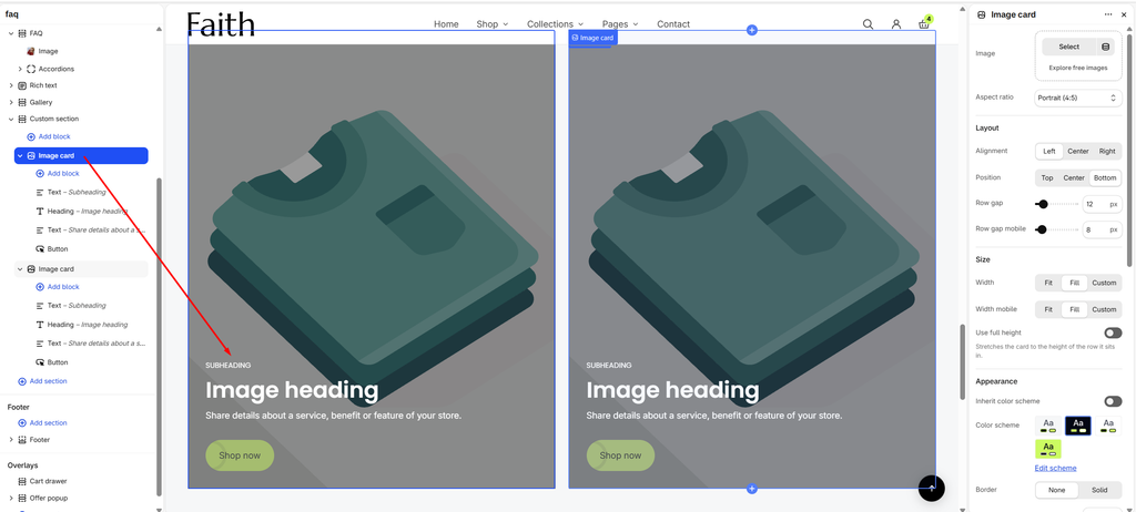
Settings
| Settings | Description |
|---|---|
| Image | The background image of the card. A placeholder image shows until you select one. |
| Aspect ratio | The shape of the card: Portrait (4:5), Portrait (3:4), Square (1:1), Landscape (3:2) or Landscape (16:9). Default: Portrait (4:5). |
| Layout | Controls where the content sits on the image. |
| Alignment | Horizontal alignment of the content: Left, Center or Right. Default: Left. |
| Position | Vertical position of the content: Top, Center or Bottom. Default: Bottom. |
| Row gap | Space between the blocks inside the card on desktop (0–100 px). Default: 12 px. |
| Row gap mobile | Space between the blocks inside the card on mobile (0–100 px). Default: 8 px. |
| Size | Controls the width and height of the card. |
| Width | Card width on desktop. Fit matches the content, Fill takes the available space, and Custom lets you set a percentage. Default: Fill. |
| Custom width | Card width on desktop as a percentage (5–100%). Default: 100%. Appears when Width is Custom. |
| Width mobile | Card width on mobile: Fit, Fill or Custom. Default: Fill. |
| Custom width | Card width on mobile as a percentage (5–100%). Default: 100%. Appears when Width mobile is Custom. |
| Use full height | Stretches the card to the height of the row it sits in. Useful when cards sit side by side and you want them all the same height. Off by default. |
| Appearance | Controls the colors and border of the card. |
| Inherit color scheme | Uses the color scheme of the parent section. On by default. |
| Color scheme | Sets a different color scheme for this card only. It affects the text and button colors on the card. Appears when Inherit color scheme is off. |
| Border | Adds a border around the card: None or Solid. Default: None. |
| Border thickness | Border width (0–10 px). Default: 1 px. Appears when Border is Solid. |
| Border opacity | How visible the border is (0–100%). Default: 100%. Appears when Border is Solid. |
| Corner radius | Rounds the card’s corners (0–100 px). Default: 0 px. |
| Overlay | A color layer between the image and the content. |
| Media overlay | Adds a color layer over the image to improve text readability. On by default. |
| Overlay color | The color of the overlay. Default: black (#000000). Appears when Media overlay is on. |
| Overlay opacity | How strong the overlay is (0–100%, in steps of 5). Default: 40%. Appears when Media overlay is on. |
| Overlay style | Solid covers the whole image evenly. Gradient fades from the overlay color to transparent. Default: Solid. Appears when Media overlay is on. |
| Gradient direction | Which way the gradient fades. Up is darkest at the bottom, Down darkest at the top, Left darkest on the left edge, and Right darkest on the right edge. Default: Up. Appears when Overlay style is Gradient. |
| Label | A small uppercase tag in the top-left corner of the card. |
| Text | The label text, for example “New” or “Limited”. Leave empty to hide the label. |
| Color | The label text color. Default: white (#FFFFFF). |
| Animation | Controls how the card appears when shoppers scroll to it. |
| Scroll animation | None, Fade in or Rise up. Default: Rise up. |
| Animation delay | Waits before the animation starts (0–800 ms, in steps of 50). Use different delays on cards in a row for a staggered effect. Default: 0 ms. Appears when Scroll animation is not None. |
| Padding | Space between the card edge and its content. The label follows the top and left padding. |
| Devices | Choose Desktop or Mobile to edit that device’s padding. The settings below change to match the device you choose. |
| Top | Space above the content. Desktop default: 32 px; mobile default: 24 px (0–100 px). |
| Bottom | Space below the content. Desktop default: 32 px; mobile default: 24 px (0–100 px). |
| Left | Space on the left. Desktop default: 32 px; mobile default: 24 px (0–100 px). |
| Right | Space on the right. Desktop default: 32 px; mobile default: 24 px (0–100 px). |
Tip: With content at the bottom, use Overlay style: Gradient with Gradient direction: Up. The image stays bright at the top and the text area stays readable.
Tip: Text on images must meet contrast guidelines. If your text is hard to read, raise Overlay opacity or choose a color scheme with a lighter text color.
Note: If you use a Label, keep the top content clear of the top-left corner (for example, set Position to Bottom) so the label and the content don’t overlap.