Overview
The Collection banner section appears at the top of every collection page. It shows the collection’s image with its title, description and breadcrumbs on top, for example Accessories with Home » Accessories. Everything comes from the collection itself (its image, title and description), so one setup works for all your collections. Add a Fallback image for collections that don’t have an image. A dark overlay keeps the text readable, and you can set different heights for desktop and mobile.
How to use
- Go to Online Store → Themes → Customize.
- From the page selector at the top, choose Collections → Default collection.
- Select Collection banner.
- Turn on Show image, and select a Fallback image for collections without their own image.
- Turn on Media overlay, then set the Overlay color, Overlay opacity and Overlay style.
- Set the Height for desktop and mobile.
- Choose the Color scheme, Section width and Padding.
- Select the Content block to set the text alignment and position, and to reorder the title, description and breadcrumbs.
- Click Save.
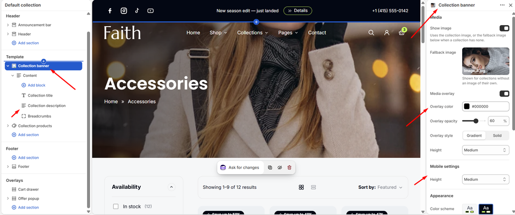
Settings
| Settings | Description |
|---|---|
| Show Image | Show an image behind the content. The banner uses the collection’s image, or the fallback image below when a collection has none. Turn this off for a plain colored banner. |
| Fallback Image | Appears when Show image is on. Select an image for collections that don’t have one of their own. |
| Media Overlay | Add a color layer over the image, so the text stays readable. |
| Overlay Color | Appears when Media overlay is on. Choose the overlay color. |
| Overlay Opacity | Appears when Media overlay is on. Adjust how strong the overlay is (0–100%). |
| Overlay Style | Appears when Media overlay is on. Choose a Gradient that fades out or a Solid layer. |
| Height | Set the banner height on desktop: Small, Medium, Large, Adapt to image or Custom. |
| Custom Height | Appears when Height is Custom. Set an exact desktop height (200–1000 px). |
| Height (Mobile settings) | Set the banner height on mobile: Small, Medium, Large, Adapt to image or Custom. |
| Custom Height (Mobile settings) | Appears when the mobile Height is Custom. Set an exact mobile height (150–800 px). |
| Color Scheme | Select a predefined color scheme for the banner text and background. The background shows when there is no image. |
| Section Width | Set how wide the section is: Same as theme, Full width, Wide, Standard, Narrow or Custom. This overrides the theme Content width for this section only. |
| Custom Section Width | Appears when Section width is Custom. Set an exact width (600–2000 px). |
| Padding | Choose Desktop or Mobile under Devices, then adjust the Top and Bottom spacing of the section for that device. |
Tip: Add an image to each collection in Shopify admin → Products → Collections → Collection image. Use a wide image, at least 1920 × 800 px, with the subject away from the side where the title sits.
Content Block
Overview
The Content block holds the text shown over the banner: the Collection title, Collection description and Breadcrumbs. You can also add a Heading, Text or Button. Its settings control where the content sits and how wide it can be. This block is part of the section and cannot be removed.
How to use
- Expand Collection banner and select Content.
- Set the Alignment for desktop and mobile, and the Position.
- Adjust the Vertical gap and Maximum width.
- Drag the inner blocks to reorder them, or click Add block to add more.
- Click Save.
Settings
| Settings | Description |
|---|---|
| Alignment | Align the content Left, Center or Right on desktop. |
| Alignment Mobile | Align the content Left, Center or Right on mobile. |
| Position | Place the content at the Top, Center or Bottom of the banner. |
| Vertical Gap | Adjust the space between the blocks inside the content (0–60 px). |
| Maximum Width | Set the maximum width of the content (300–1200 px). Long descriptions wrap at this width, so they stay easy to read. |
Collection Title Block
Overview
The Collection title block shows the name of the current collection, for example Accessories.
How to use
- Expand Collection banner → Content and select Collection title.
- Choose the Preset.
- Click Save.
Settings
| Settings | Description |
|---|---|
| Preset | Choose the title style: Heading 1, Heading 2, Heading 3 or Heading 4. Styles come from Theme settings → Typography. |
Note: The title always uses the H1 tag, so each collection page has one main heading for SEO.
Collection Description Block
Overview
The Collection description block shows the description of the current collection. It has no settings. Edit the text in Shopify admin → Products → Collections → Description. If a collection has no description, nothing is shown.
How to use
- Expand Collection banner → Content.
- Drag Collection description to where you want it, for example below the title.
- To change the text, go to Shopify admin → Products → Collections, open the collection, and edit its Description.
Tip: Keep the description to one or two sentences in the banner. A short, keyword-rich description helps SEO without pushing the products down the page.
Breadcrumbs Block
Overview
The Breadcrumbs block shows the path to the current page, for example Home » Accessories, so customers can see where they are and go back easily. Breadcrumbs also help search engines understand your store’s structure.
How to use
- Expand Collection banner → Content and select Breadcrumbs.
- Choose whether to show the Collections link.
- Click Save.
Settings
| Settings | Description |
|---|---|
| Show “Collections” Link | Add a Collections step between Home and the collection, for example Home » Collections » Accessories. It links to your all-collections page. |
Blocks: Heading, Text and Button are common blocks. See their articles for settings.