Overview
Swatches turn a product option, usually Color, into small color or image circles instead of plain text. Customers see the actual colors at a glance, both on the product page and on product cards. Faith decides which options become swatches by their name, for example Color or Colour. The color of each swatch comes from one of these:
- Shopify’s native swatches
- your own Color list
- the variant images
- standard color names, such as Red or Navy
All swatch settings are in Theme settings → Swatches.
How to use
- Go to Online Store → Themes → Customize.
- Click Theme settings (the gear icon), then open Swatches.
- Check that Swatch option names includes the name of your color option, for example Color.
- Choose the Swatch source, then the size, shape and content.
- Choose how swatches appear On product cards.
- Add any custom colors to the Color list.
- Click Save, then check a product page and a collection page.
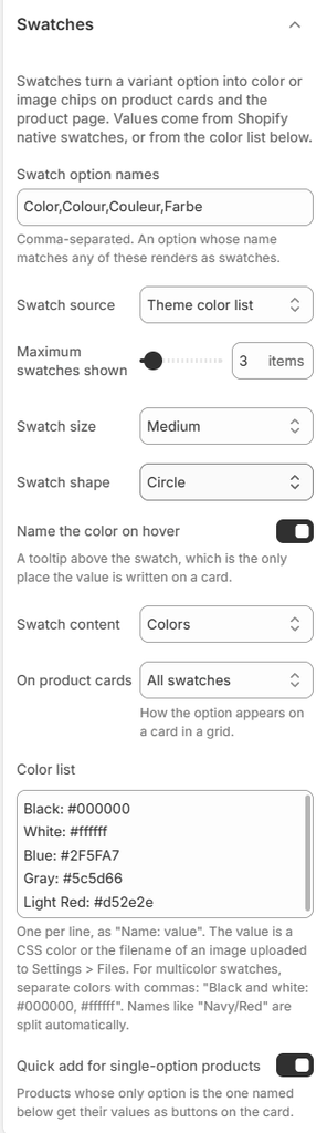
Settings
| Settings | Description |
|---|---|
| Swatch Option Names | Enter the option names that should show as swatches, separated by commas. The default is Color, Colour, Couleur, Farbe. An option whose name matches any of these (not case-sensitive) shows as swatches. |
| Swatch Source | Choose where swatch colors come from: Theme color list (your Color list below), Shopify native swatches (the colors and images set on each option value in Shopify admin), or Disabled (no swatches; color options show as buttons). |
| Maximum Swatches Shown | Set how many swatches show on a product card when On product cards is Limited swatches (0–50). The rest show as +N. |
| Swatch Size | Choose the swatch size: Regular, Medium or Large. |
| Swatch Shape | Choose the swatch shape: Circle, Rounded or Square. |
| Name the Color on Hover | Show the color name in a tooltip above the swatch on hover. On product cards, this is the only place the color name is written. |
| Swatch Content | Fill swatches with Colors, or with Variant images (each color’s own product photo). |
| On Product Cards | Choose how the color option appears on cards: Count only (for example 6 colors), Limited swatches (up to Maximum swatches shown, then +N) or All swatches. |
| Color List | Your own color names and values, one per line, as Name: value. The value is a CSS color (for example #2F5FA7) or the filename of an image uploaded to Settings → Files (for example leopard.png). For multicolor swatches, separate colors with commas, for example Black and white: #000000, #ffffff. |
| Quick Add for Single-Option Products | On product cards, products whose only option is the one named below show its values as buttons, so customers can add a size straight from the card. |
| Single Option Name | The option name used for card quick add, usually Size. Separate several names with commas. |
How the Swatch Color Is Chosen
Overview
For each color value, Faith checks these sources in order and uses the first one it finds. This means you only need to add colors that Faith can’t work out on its own.
How to use
- Name your color values with standard color names where possible, for example Black, Navy or Beige. These work without setup.
- For custom names, such as Sand, Forest or Light Red, add a line to the Color list, for example Sand: #D8C3A5.
- For patterns, upload an image to Settings → Files, then add it to the Color list, for example Leopard: leopard.png.
- To use Shopify’s own swatches instead, set Swatch source to Shopify native swatches, and set the colors in Shopify admin → Products → Variants.
Settings
| Settings | Description |
|---|---|
| 1. Variant Image | If Swatch content is Variant images, the swatch shows the image of the variant with that color. |
| 2. Shopify Native Swatch | If Swatch source is Shopify native swatches, the color or image set on the option value in Shopify admin is used. |
| 3. Color List | If the color’s name matches a line in the Color list (not case-sensitive), that color, image or multicolor value is used. |
| 4. Split Names | Names with a slash, such as Navy/Red, are split into two colors and shown as a half-and-half swatch. Each part is looked up in the Color list, or as a standard color name. |
| 5. Standard Color Name | Standard CSS color names, such as Red, Navy, Beige or Light Blue, are used as they are. |
| 6. Fallback | If no color is found, the swatch shows a light neutral grey. Add the name to the Color list to fix it. |
Tip: If a swatch shows grey, add its exact name to the Color list, for example Sand: #D8C3A5. The name must match the option value spelling.
Swatches on the Product Page
Overview
On the product page, the Variant selector block shows the color option as swatches and the other options as buttons or dropdowns, for example Color: Beige with color circles, and Size: S with buttons. When a customer picks a color, these update to match:
- the product images
- the price
- the stock
- the URL
Sold-out colors are crossed out.
How to use
- Go to Online Store → Themes → Customize, and open Products → Default product.
- Expand Product details and select Variant selector.
- Set Swatches type to Swatch, or to Variant image, Buttons or Dropdowns.
- Turn on Show selected value to show the color name, for example Color: Beige.
- Click Save.

Settings
| Settings | Description |
|---|---|
| Swatches Type | Variant selector block. Show the color option as Swatch, Variant image, Buttons or Dropdowns. |
| Size Options | Variant selector block. Show the size option as Dropdowns or Buttons. Size options are recognized by Single option name. |
| Show Selected Value | Variant selector block. Show the chosen value after the option name, for example Color: Beige. |
| Swatch Size and Shape | Theme settings → Swatches. Used on the product page too. |
Tip: Give each color variant its own image in Shopify admin → Products → Variants, so the gallery moves to the right photo when a customer picks a color.
Swatches on Product Cards
Overview
On product cards, swatches show under the image in collections, search and product sliders. Clicking a swatch on the card updates the card’s image, price and sale badge to that color, without opening the product page. If quick add is on, it then adds that color. Products with a single size option can also show a size panel on hover, so customers can pick a size and add it from the card.
How to use
- In Theme settings → Swatches, choose On product cards, and set Maximum swatches shown if you use Limited swatches.
- Turn on Name the color on hover, so customers see the color name.
- Turn on Quick add for single-option products, and check Single option name (usually Size).
- In Theme settings → Product cards, set the size panel options and quick add button.
- Click Save, then test on a collection page.
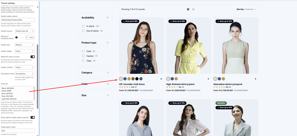
Settings
| Settings | Description |
|---|---|
| On Product Cards | Swatches. Choose Count only, Limited swatches or All swatches. |
| Maximum Swatches Shown | Swatches. The number of swatches shown before +N when On product cards is Limited swatches. |
| Name the Color on Hover | Swatches. Show the color name in a tooltip, since cards don’t show the name otherwise. |
| Quick Add for Single-Option Products | Swatches. Show the size values as buttons in a panel that opens over the bottom of the card on hover. |
| Values to Show | Product cards. Set how many size buttons the panel shows (2–10). |
| Show the Chosen Value Beside the Label | Product cards. Show the selected size next to the label, for example Size: M. |
| Show the Vendor | Product cards. Show Brand: … opposite the size label in the panel. |
| Show Sibling Products | Product cards. Show sibling products instead of the product’s own color swatches. See the Product Siblings articles. |
Tip: Use Limited swatches with 4 or 5 swatches for a clean grid. All swatches works well when products have few colors.