Product Information Section
Overview
The Product information section is the main part of every product page. It has two parts: Product media (the image and video gallery) and Product details (title, price, variants, buy buttons and more). Both are part of the section and cannot be removed. Inside Product details, you add, remove and reorder blocks to build the page you want: reviews, SKU, stock level, size guide, purchase options, share buttons, accordions, complementary products and more. The section’s settings control the layout: how wide the media is, which side it sits on, the gap and the colors.
How to use
- Go to Online Store → Themes → Customize.
- From the page selector at the top, choose Products → Default product.
- Select Product information, then set the Layout size, Media position, Gap and Color scheme.
- Select Product media to set up the gallery.
- Expand Product details. Click a block to edit it, drag blocks to reorder them, or click Add block to add more.
- Set the Section width and Padding.
- Click Save.
Tip: To give some products a different layout, click Default product → Create template, customize the new template, then assign it to products in Shopify admin → Products → Theme template.
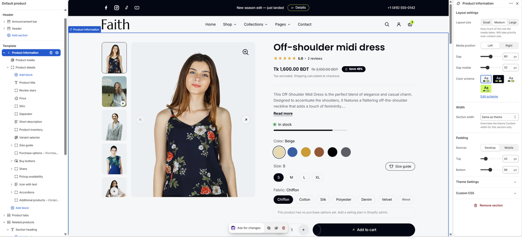
Settings
| Settings | Description |
|---|---|
| Layout Size | Set how much of the row the media takes: Small, Medium or Large. This takes priority over the content width. |
| Media Position | Place the media on the Left or Right of the product details. |
| Gap | Adjust the space between the media and the details on desktop (0–160 px). |
| Gap Mobile | Adjust the space between the media and the details on mobile (0–100 px). |
| Color Scheme | Select a predefined color scheme for the section. |
| Section Width | Set how wide the section is: Same as theme, Full width, Wide, Standard, Narrow or Custom. This overrides the theme Content width for this section only. |
| Custom Section Width | Appears when Section width is Custom. Set an exact width (600–2000 px). |
| Padding | Choose Desktop or Mobile under Devices, then adjust the Top and Bottom spacing of the section for that device. |
Product Media Block
Overview
The Product media block is the product’s image and video gallery. Show it as a Carousel with thumbnails, dots or a counter, or as a Grid of images. Customers can zoom into images, watch videos and view 3D models. When a customer selects a variant, the gallery moves to that variant’s image, and it can hide the media of other variants. This block is part of the section and cannot be removed.
How to use
- Expand Product information and select Product media.
- Choose the Type: Grid or Carousel.
- Set the grid or carousel options: navigation, pagination and thumbnails.
- Under Media, choose the Aspect ratio, Corner radius and Zoom.
- Click Save.

Settings
| Settings | Description |
|---|---|
| Sticky on Desktop | Keep the gallery in view while customers scroll the product details on desktop. |
| Type | Show the media as a Grid or a Carousel. |
| Show Next and Previous Slides | Appears when Type is Carousel. From tablet up, show a strip of the neighbouring slides at each side (0–160 px). 0 turns it off. |
| Columns | Appears when Type is Grid. Show 1 or 2 images per row. |
| Gap | Appears when Type is Grid. Adjust the space between images (0–40 px). |
| Full Width First Image | Appears when Type is Grid with 2 columns. Show the first image across the full width, above the others. |
| Mobile Slides Per View | Show 1 or 2 images at a time on mobile. |
| Navigation | Choose the carousel arrows: Arrows, Arrows on hover or None. |
| Arrow Style | Appears when Navigation is not None. Choose Diagonal arrow, Left / right arrow or Chevron. |
| Desktop Pagination | Appears when Type is Carousel. Show Dots, Counter, Thumbnails or None on desktop. |
| Mobile Pagination | Show Dots, Counter, Hint, Thumbnails or None on mobile. Hint shows part of the next slide, so customers know they can swipe. |
| Navigation Color | Select a color scheme for the arrows and pagination. |
| Desktop Position | Appears when Desktop pagination is Thumbnails. Place the thumbnails on the Left, at the Bottom or on the Right. |
| Desktop Thumbnail Width | Appears when Desktop pagination is Thumbnails. Set the thumbnail width (56–160 px). |
| Thumbnail Corner Radius | Customize the rounded corners of the thumbnails (0–40 px). |
| Aspect Ratio | Choose the image shape: Portrait (4:5), Portrait (3:4), Portrait (2:3), Square (1:1) or Original. |
| Corner Radius | Customize the rounded corners of the media (0–40 px). |
| Zoom | Choose how customers zoom into images: On hover, On click or None. |
| Video Loop | Play product videos on repeat. |
| Hide Unselected Variant Media | Show only the selected variant’s media: its image and the media after it, up to the next variant’s image. |
| Padding | Choose Desktop or Mobile under Devices, then adjust the Top and Bottom spacing of the block for that device (0–100 px). |
Variant images by alt text: To link media to a color, add the alt text in the format alt text|Color:Green in Shopify admin → Products → Media → Edit alt text. Media tagged this way always filters by that option, with or without Hide unselected variant media. Untagged media shows for every color.
Product Details Block
Overview
The Product details block holds all the product information next to the gallery. It contains the product blocks described below, and also accepts Text, Button, Image, Group, Custom Liquid and app blocks. Its settings control the width, the gap between blocks, and an optional background, border or color scheme. This block is part of the section and cannot be removed.
How to use
- Expand Product information and select Product details.
- Set the Size, Gap and Sticky on desktop.
- Optionally, set a custom color scheme, background, border and corner radius.
- Click Add block to add product blocks, and drag them to reorder.
- Click Save.
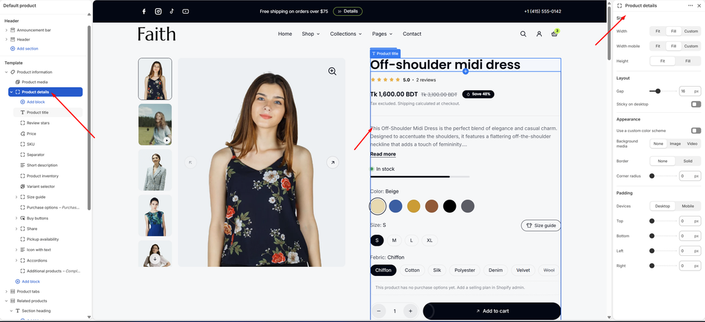
Settings
| Settings | Description |
|---|---|
| Width | Set the width on desktop: Fit, Fill or Custom. |
| Custom Width | Appears when Width is Custom. Set the width as a percentage (5–100%). |
| Width Mobile | Set the width on mobile: Fit, Fill or Custom. Custom shows its own Custom width slider. |
| Height | Choose Fit (as tall as its content) or Fill (as tall as the gallery). |
| Gap | Adjust the space between the blocks (0–60 px). |
| Sticky on Desktop | Keep the details in view while customers scroll a long gallery on desktop. |
| Use a Custom Color Scheme | Give the details their own color scheme. |
| Color Scheme | Appears when Use a custom color scheme is on. Select the color scheme. |
| Background Media | Add a background: None, Image or Video. |
| Image | Appears when Background media is Image. Select the background image. |
| Video | Appears when Background media is Video. Select the background video. |
| Border | Add a border: None or Solid. |
| Border Thickness | Appears when Border is Solid. Adjust the border thickness (0–10 px). |
| Border Opacity | Appears when Border is Solid. Adjust how visible the border is (0–100%). |
| Corner Radius | Customize the rounded corners (0–100 px). |
| Padding | Choose Desktop or Mobile under Devices, then adjust the Top, Bottom, Left and Right spacing inside the block (0–100 px). |
Tip: Turn on Sticky on desktop for either Product media or Product details, not both. Make the shorter one sticky, so it stays in view while the longer one scrolls.
Product Title Block
Overview
The Product title block shows the product name as the page’s main heading (H1).
How to use
- Expand Product details and select Product title.
- Choose the Title typography and Alignment.
- Click Save.
Settings
| Settings | Description |
|---|---|
| Title Typography | Choose the title style: Default, Paragraph, Subheading, Heading 1–6 or Custom. |
| Custom Typography | Appears when Title typography is Custom. Set the Font size (desktop and mobile, 10–80 px), Font weight, Line height (80–200%) and Letter spacing (-5 to 10%). |
| Alignment | Align the title Left, Center or Right. |
| Padding | Choose Desktop or Mobile under Devices, then adjust the Top and Bottom spacing (0–100 px). |
Review Stars Block
Overview
The Review stars block shows the product rating and review count, for example ★★★★★ 5.0 • 2 reviews. It reads the reviews.rating and reviews.rating_count metafields that your reviews app writes, so it works with Judge.me, Shopify Product Reviews, Loox and similar apps. Clicking the stars scrolls to the reviews section.
How to use
- Install a reviews app that writes the standard review metafields.
- Expand Product details and select Review stars.
- Enter the Reviews section ID of your app’s review widget.
- Click Save.
Settings
| Settings | Description |
|---|---|
| Reviews Section ID | Enter the ID of your reviews app’s widget, with or without #, so clicking the stars scrolls to it. Examples: judgeme_product_reviews, shopify-product-reviews, looxReviews, or any CSS selector. |
| Show Stars When There Are No Reviews | Show empty stars on products without reviews. |
| Padding | Choose Desktop or Mobile under Devices, then adjust the Top and Bottom spacing (0–100 px). |
Price Block
Overview
The Price block shows the selected variant’s price. On sale it also shows the compare-at price and a sale badge, for example Save 48%. It can show the tax note and Shop Pay installments.
How to use
- Expand Product details and select Price.
- Choose whether to show badges, the tax note and Shop Pay installments.
- Set the Font size.
- Click Save.
Settings
| Settings | Description |
|---|---|
| Show Badges | Show sale, pre-order and sold out badges next to the price. Badges are styled in Theme settings → Product badges. |
| Show Tax Note | Show a note such as Tax excluded. Shipping calculated at checkout. |
| Show Shop Pay Installments | Show the Shop Pay installments message, when Shop Pay Installments is available for your store. |
| Font Size | Set the price size on desktop (14–40 px). |
| Font Size on Mobile | Set the price size on mobile (14–40 px). |
| Padding | Choose Desktop or Mobile under Devices, then adjust the Top and Bottom spacing (0–100 px). |
SKU Block
Overview
The SKU block shows the selected variant’s SKU, for example SKU: FD-1024. It updates when the customer changes the variant, and is hidden when the variant has no SKU.
How to use
- Expand Product details, click Add block → SKU, and drag it into place.
- Choose whether to Show label, and set the typography.
- Click Save.
Settings
| Settings | Description |
|---|---|
| Show Label | Show SKU: before the code. |
| SKU Typography | Choose the text style: Default, Paragraph, Subheading, Heading 1–6 or Custom. |
| Custom Typography | Appears when SKU typography is Custom. Set the Font size (desktop and mobile, 10–80 px), Font weight, Line height and Letter spacing. |
| Padding | Choose Desktop or Mobile under Devices, then adjust the Top and Bottom spacing (0–100 px). |
Vendor Block
Overview
The Vendor block shows the product’s brand or vendor name, for example above the title. It can link to a page listing all products from that vendor.
How to use
- Expand Product details, click Add block → Vendor, and drag it into place.
- Choose whether to link to the vendor’s products, and set the typography.
- Click Save.
Settings
| Settings | Description |
|---|---|
| Link to Vendor’s Products | Make the vendor name a link to all products from that vendor. |
| Vendor Typography | Choose the text style: Default, Paragraph, Subheading, Heading 1–6 or Custom. |
| Custom Typography | Appears when Vendor typography is Custom. Set the Font size (desktop and mobile, 10–80 px), Font weight, Line height and Letter spacing. |
| Padding | Choose Desktop or Mobile under Devices, then adjust the Top and Bottom spacing (0–100 px). |
Separator Block
Overview
The Separator block adds a horizontal line between product blocks, for example between the price and the description.
How to use
- Expand Product details, click Add block → Separator, and drag it into place.
- Choose the Style, Border thickness and Opacity.
- Click Save.
Settings
| Settings | Description |
|---|---|
| Style | Choose the line style: Solid, Dashed or Dotted. |
| Border Thickness | Adjust the line thickness (1–6 px). |
| Opacity | Adjust how visible the line is (10–100%). |
| Padding | Choose Desktop or Mobile under Devices, then adjust the Top and Bottom spacing (0–100 px). |
Short Description Block
Overview
The Short description block shows a short summary of the product, with a Read more link when the text is long. Connect it to a metafield to show a separate summary, or leave it empty to use the product description.
How to use
- Expand Product details and select Short description.
- Leave Text empty to use the product description, or click the Connect dynamic source icon and choose a metafield.
- Set the Style, Size and Collapsed height.
- Click Save.
Settings
| Settings | Description |
|---|---|
| Text | Connect a metafield or the product description. Leave it empty to use the product description. |
| Style | Choose the text style: Body or Subheading. |
| Size | Set the text size: Small, Medium or Large. |
| Collapsed Height (Lines) | Cut longer text to this many lines, with a Read more link (0–12). 0 shows it all. |
| Width | Choose Fit or Fill. |
| Alignment | Align the text Left, Center or Right. |
| Padding | Choose Desktop or Mobile under Devices, then adjust the Top, Bottom, Left and Right spacing (0–100 px). |
Description Block
Overview
The Description block shows the full product description from Shopify admin → Products → Description, with no Read more cut.
How to use
- Expand Product details, click Add block → Description, and drag it into place.
- Choose the Description typography.
- Click Save.
Settings
| Settings | Description |
|---|---|
| Description Typography | Choose the text style: Default, Paragraph, Subheading, Heading 1–6 or Custom. |
| Custom Typography | Appears when Description typography is Custom. Set the Font size (desktop and mobile, 10–80 px), Font weight, Line height and Letter spacing. |
| Padding | Choose Desktop or Mobile under Devices, then adjust the Top and Bottom spacing (0–100 px). |
Tip: Use either Short description or Description here, not both. If the full description is in Product tabs, use Short description in this area.
Product Inventory Block
Overview
The Product inventory block shows the selected variant’s stock status, for example In stock, Only 3 left or Out of stock, with a colored dot and a stock bar. Low stock messages create urgency and can help conversions.
How to use
- Expand Product details and select Product inventory.
- Set the Low stock threshold, and choose what to show.
- Click Save.
- Make sure inventory is tracked in Shopify admin → Products → Inventory → Track quantity.
Settings
| Settings | Description |
|---|---|
| Low Stock Threshold | Set the stock level at which the status changes to low stock (1–100). |
| Show Low Stock Quantity | Show the number left when stock is low, for example Only 3 left. |
| Show Quantity When in Stock | Show the number available even when stock is not low, for example 24 in stock. |
| Show Status Dot | Show a colored dot: green for in stock, orange for low stock, red for out of stock. |
| Show Stock Bar | Show a bar that reflects the stock level. |
| Full Bar Quantity | Appears when Show stock bar is on. Set the stock level that fills the bar (5–200). |
| Status Typography | Choose the text style: Default, Paragraph, Subheading, Heading 1–6 or Custom. |
| Custom Typography | Appears when Status typography is Custom. Set the Font size (desktop and mobile, 10–80 px), Font weight, Line height and Letter spacing. |
| Padding | Choose Desktop or Mobile under Devices, then adjust the Top and Bottom spacing (0–100 px). |
Variant Selector Block
Overview
The Variant selector block lets customers choose the product options, such as Color, Size and Fabric. Colors show as swatches, and other options as buttons or dropdowns. Sold-out values are crossed out. Color and size options are recognized by the option names set in Theme settings → Swatches.
How to use
- Expand Product details and select Variant selector.
- Choose how Size options, Other options and color swatches appear.
- Set the Alignment and Show selected value.
- Click Save.
Settings
| Settings | Description |
|---|---|
| Size Options | Show size options as Dropdowns or Buttons. |
| Other Options | Show other options, such as material, as Dropdowns or Buttons. |
| Swatches Type | Show color options as Swatch (color circles), Variant image, Buttons or Dropdowns. |
| Alignment | Align the options Left, Center or Right. |
| Show Selected Value | Show the chosen value after the option name, for example Color: Beige. |
| Option Label Typography | Choose the label style: Default, Paragraph, Subheading, Heading 1–6 or Custom. |
| Custom Typography | Appears when Option label typography is Custom. Set the Font size (desktop and mobile, 10–80 px), Font weight, Line height and Letter spacing. |
| Padding | Choose Desktop or Mobile under Devices, then adjust the Top and Bottom spacing (0–100 px). |
Tip: Swatch colors come from Shopify’s color names, Shopify’s Color category metafield, or the custom colors you add in Theme settings → Swatches.
Sibling Products Block
Overview
The Sibling products block links colorways that are sold as separate products, for example a dress in red and the same dress in blue, each with its own product page. Customers see them as swatches and can switch between the products. The block reads the theme.sibling_products metafield, or a collection handle in theme.siblings. Each colorway’s name and color come from:
- its theme.sibling_color metafield (text, color or a color metaobject)
- Shopify’s Color category metafield
- or its own Color option
Without any of these, the product title and image are used.
How to use
- In Shopify admin → Settings → Custom data → Products, create a metafield theme.sibling_products (type: Product, list of products).
- On each colorway, select the other colorways in this metafield.
- In the editor, expand Product details, click Add block → Sibling products, and drag it into place.
- Set the Label, Swatches type and Alignment.
- Click Save.
Settings
| Settings | Description |
|---|---|
| Label | Enter the label shown above the swatches, for example Color. |
| Color Metafield | Optional. Enter the namespace.key of a product metafield (Text, Color or a color metaobject) that holds each sibling’s color, for example custom.sibling_color. Leave it empty to try theme.sibling_color, then custom.sibling_color, then the product’s own color option. |
| Swatches Type | Show the siblings as Swatch, Product image or Buttons. |
| Alignment | Align the swatches Left, Center or Right. |
| Show Selected Value | Show the current colorway’s name after the label. |
| Option Label Typography | Choose the label style: Default, Paragraph, Subheading, Heading 1–6 or Custom. |
| Custom Typography | Appears when Option label typography is Custom. Set the Font size (desktop and mobile, 10–80 px), Font weight, Line height and Letter spacing. |
| Padding | Choose Desktop or Mobile under Devices, then adjust the Top and Bottom spacing (0–100 px). |
Size Guide Block
Overview
The Size guide block adds a Size guide button that opens a popup with your size chart. Build the chart with the Size chart table block, add text and images, or show the content of a page. Connect a page reference metafield to give each product type its own chart.
How to use
- Expand Product details and select Size guide.
- Set the Label, Icon and Style of the button.
- Under Modal, add an Image, a Page content, or both, and choose the Color scheme.
- Expand Size guide and edit the Size chart table, or add Text, Image or app blocks.
- Click Save.
Settings
| Settings | Description |
|---|---|
| Label | Enter the button text, for example Size guide. |
| Icon | Show an icon on the button: None, T-shirt, Hanger or Ruler. |
| Style | Show the button as Outline or Link. |
| Only Products With a Size Option | Hide the button on products that don’t have a size option. |
| Image | Select an image to show in the popup, for example a measuring guide. |
| Page Content | Select a page to show under the blocks in the popup. Connect a page reference metafield to give each product type its own chart. |
| Color Scheme | Select a predefined color scheme for the popup. |
| Padding | Choose Desktop or Mobile under Devices, then adjust the Top and Bottom spacing (0–100 px). |
Size Chart Table
| Settings | Description |
|---|---|
| Heading | Enter the table heading, for example Size chart. |
| Rows | Enter one row per line, with cells separated by commas (or |). The first line is the header row. Example: Size, Bust (cm), Waist (cm), Hips (cm). |
| Padding | Choose Desktop or Mobile under Devices, then adjust the Top and Bottom spacing (0–100 px). |
Purchase Options Block
Overview
The Purchase options block shows subscription and one-time purchase choices when a product has selling plans, for example Subscribe & save 10%. Selling plans come from a subscriptions app, such as Shopify Subscriptions. Products without selling plans don’t show it on the storefront. The editor shows a note instead.
How to use
- Install a subscriptions app and add a selling plan to the product.
- Expand Product details and select Purchase options.
- Enter the Heading, and choose whether to show the plan group name and the policy link.
- Click Save.
Settings
| Settings | Description |
|---|---|
| Heading | Enter the heading, for example Purchase options. |
| Show Plan Group Name | Show the name of the selling plan group, for example Subscribe & save. |
| Show Subscription Policy Link | Show a link to your subscription policy, from Settings → Policies. |
| Heading Typography | Choose the heading style: Default, Paragraph, Subheading, Heading 1–6 or Custom. |
| Custom Typography | Appears when Heading typography is Custom. Set the Font size (desktop and mobile, 10–80 px), Font weight, Line height and Letter spacing. |
| Padding | Choose Desktop or Mobile under Devices, then adjust the Top and Bottom spacing (0–100 px). |
Buy Buttons Block
Overview
The Buy buttons block holds the Quantity selector, the Add to cart button and Accelerated checkout (Buy it now, Shop Pay, Apple Pay and other wallets). For gift cards, it can show a form to send the card to someone else. For sold-out variants, it can show an Ask about availability form.
How to use
- Expand Product details and select Buy buttons.
- Choose whether to show the gift card recipient form and the availability request form.
- Expand Buy buttons to edit the Add to cart button.
- Click Save.
Settings
| Settings | Description |
|---|---|
| Show Gift Card Recipient Form | On gift card products, let the buyer send the card to someone else by email. |
| Show Availability Request Form | On sold-out variants, show an Ask about availability button. Requests reach you by email through the contact form. Customers are not notified automatically, so reply yourself or use a back-in-stock app. |
| Padding | Choose Desktop or Mobile under Devices, then adjust the Top and Bottom spacing (0–100 px). |
Add to Cart Button
| Settings | Description |
|---|---|
| Style | Choose the button style: Primary or Secondary. Styles are set in Theme settings → Buttons. |
| Show Icon | Show the arrow icon on the button. |
Quantity selector has no settings. Accelerated checkout shows Buy it now and wallet buttons. Choose which appear in Shopify admin → Settings → Payments.
Share Block
Overview
The Share block lets customers share the product on social media or copy the link. It can also show a Need help? link to your contact page. Share networks are chosen in Theme settings → Social media.
How to use
- Expand Product details and select Share.
- Enter the Text, and choose whether to show the copy link button and card style.
- Enter the Help link text and select a Help link.
- Click Save.
Settings
| Settings | Description |
|---|---|
| Text | Enter the label before the share buttons, for example Share:. |
| Show Copy Link Button | Show a button that copies the product link. |
| Card Style | Show the share row inside a card with a background. |
| Help Link Text | Enter the help link text, for example Need help? |
| Help Link | Select your contact page. The link is hidden until one is set. |
| Padding | Choose Desktop or Mobile under Devices, then adjust the Top and Bottom spacing (0–100 px). |
Blocks: You can add Text or Button blocks inside Share. They sit on the right of the share row.
Pickup Availability Block
Overview
The Pickup availability block shows whether the selected variant can be picked up in store, for example Pickup available at Main Street, usually ready in 24 hours. It connects automatically to your pickup locations, and appears only when the variant can be picked up.
How to use
- Turn on local pickup in Shopify admin → Settings → Shipping and delivery → Local pickup.
- Expand Product details and select Pickup availability.
- Choose whether to use the Card style.
- Click Save.
Settings
| Settings | Description |
|---|---|
| Card Style | Show the pickup information inside a card with a background. |
| Padding | Choose Desktop or Mobile under Devices, then adjust the Top and Bottom spacing (0–100 px). |
Icon With Text Block
Overview
The Icon with text block shows a row or grid of small benefits under the buy buttons, for example Free shipping and Easy returns. Each item is an Icon box.
How to use
- Expand Product details and select Icon with text.
- Set the Columns and gaps.
- Expand it to edit each Icon box, or click Add block to add more.
- Click Save.
Settings
| Settings | Description |
|---|---|
| Columns on Desktop | Set how many items show in each row on desktop (1–4). |
| Columns on Mobile | Set how many items show in each row on mobile: 1 or 2. |
| Horizontal Gap | Adjust the space between items side by side (0–80 px). |
| Vertical Gap | Adjust the space between rows (0–80 px). |
| Padding | Choose Desktop or Mobile under Devices, then adjust the Top and Bottom spacing (0–100 px). |
Icon box: See the Icon Box article for each item’s settings.
Accordions Block
Overview
The Accordions block shows expandable rows under the product details, for example Shipping and returns, Care instructions and Materials. Each row is an Accordion item. Its content can come from a page, or from the Text, Button and Image blocks inside it.
How to use
- Expand Product details and select Accordions.
- Choose the Style, Toggle icon and Open one at a time.
- Set the heading and content typography.
- Expand Accordions to edit each Accordion item, or click Add block to add more.
- Click Save.
Settings
| Settings | Description |
|---|---|
| Style | Show the rows as Cards (each in a box) or Lines (separated by lines). |
| Toggle Icon | Choose the open and close icon: Plus / minus or Chevron. |
| Open One at a Time | Close the open row when another one opens. |
| Gap | Adjust the space between rows (0–40 px). |
| Heading Typography | Choose the row heading style: Default, Paragraph, Subheading, Heading 1–6 or Custom. |
| Heading Font | Choose the heading font: Accent, Heading or Body. |
| Content Typography | Choose the row content style: Default, Paragraph, Subheading, Heading 1–6 or Custom. |
| Custom Typography | Appears when Heading or Content typography is Custom. Set the Font size (desktop and mobile, 10–80 px), Font weight, Line height and Letter spacing. |
| Padding | Choose Desktop or Mobile under Devices, then adjust the Top and Bottom spacing (0–100 px). |
Accordion Item
| Settings | Description |
|---|---|
| Heading | Enter the row heading, for example Shipping and returns. |
| Icon | Show an icon before the heading: None, Box, Delivery, Truck, Return, Shield, Washing, Ironing, Leaf, Ruler, Question, Chat or Info. |
| Row Content From Page | Select a page to show its content in the row, for example your shipping policy page. Edit the page once, and every product updates. |
| Open by Default | Show the row open when the page loads. |
Tip: For product-specific content, add a Text block inside the Accordion item and connect it to a product metafield, for example Care instructions.
Additional Products Block
Overview
The Additional products block shows a small carousel of complementary products, for example Complete the look, so customers can add matching items. Choose them in Search & Discovery, Shopify’s free app. Products without complementary products don’t show the block on the storefront. The editor shows a note instead.
How to use
- Install Search & Discovery, then go to Apps → Search & Discovery → Product recommendations.
- Choose a product and add its Complementary products.
- In the editor, expand Product details and select Additional products.
- Enter the Heading, and set the carousel options.
- Click Save.
Settings
| Settings | Description |
|---|---|
| Heading | Enter the heading, for example Complementary products or Complete the look. |
| Heading Typography | Choose the heading style: Default, Paragraph, Subheading, Heading 1–6 or Custom. |
| Custom Typography | Appears when Heading typography is Custom. Set the Font size (desktop and mobile, 10–80 px), Font weight, Line height and Letter spacing. |
| Maximum Products | Set the most products shown (2–10). |
| Products Per View on Desktop | Set how many products are visible at once on desktop (1–4). Use a value like 2.5 to show part of the next product. |
| Products Per View on Mobile | Set how many products are visible at once on mobile (1–3). |
| Show Dots | Show navigation dots below the carousel. |
| Auto-rotate Slides | Move through the products automatically. |
| Change Slides Every | Appears when Auto-rotate slides is on. Set how long each slide shows (3–10 seconds). |
| Padding | Choose Desktop or Mobile under Devices, then adjust the Top and Bottom spacing (0–100 px). |
Blocks: Text, Button, Image, Group, Custom Liquid and app blocks (for example a reviews or upsell app) can also be added inside Product details. See their articles for settings.