

Go to Shopify Admin → Online Store → Themes
Click Customize on your active theme.
Open Blog Template
- Click the template selector at the top
- Select Blogs
- Choose your blog template (Example: Default blog / News)
Now you can customize the blog page layout.
Blog Page Sections
You can customize:
- Page banner
- Blog list/grid
- Blog article cards
- Newsletter section
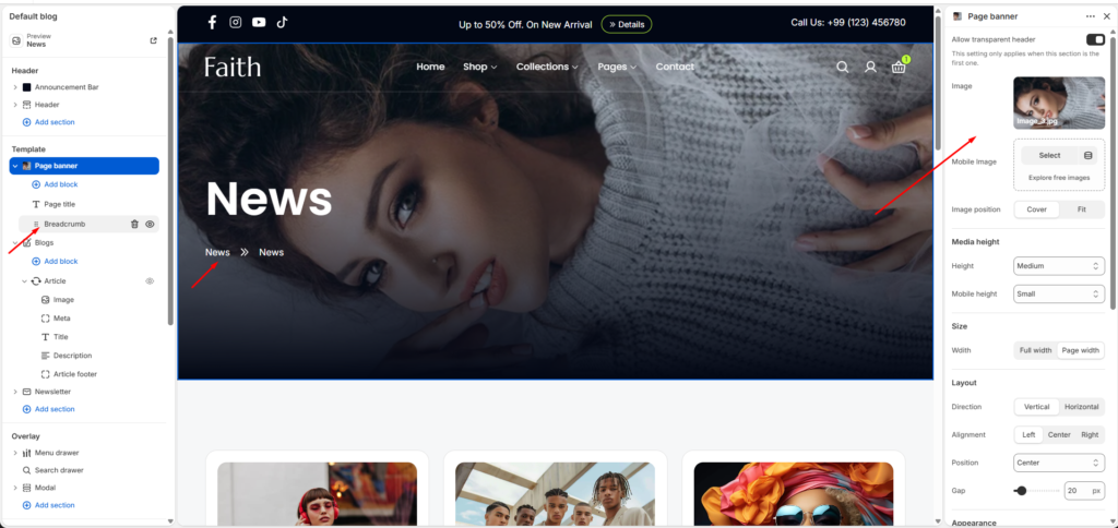
Page Banner Section
Select Page banner.
Settings:
| Setting | Description |
|---|---|
| Image | Upload blog banner image. |
| Mobile Image | Upload separate mobile banner. |
| Image Position | Choose Cover or Fit style. |
| Media Height | Adjust desktop banner height. |
| Mobile Height | Adjust mobile banner height. |
| Width | Choose Full width or Page width. |
| Direction | Vertical or Horizontal layout. |
| Alignment | Align content Left, Center, Right. |
| Position | Adjust content placement. |
| Gap | Control spacing between elements. |
Available blocks:
- Page title
- Breadcrumb
Use this section to edit:
- Blog title
- Navigation path
- Banner appearance
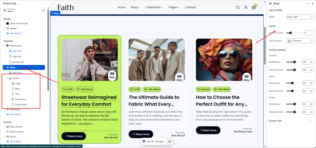
Blog List Section
Select Blogs section.
Customize:
| Setting | Description |
|---|---|
| Width | Control blog container width. |
| Articles To Show | Choose number of blog posts displayed. |
| Color Scheme | Change blog design colors. |
| Padding Top | Adjust top spacing. |
| Padding Bottom | Adjust bottom spacing. |
Blog Article Card
Inside Blogs section select Article block.
Available blocks:
Image
Controls blog featured image display.
Meta
Shows article information:
- Blog category
- Reading time
- Date
Title
Displays blog post heading.
Description
Shows article excerpt/summary.
Article Footer
Controls:
- Read more button
- Author information
You can hide/show each block using the visibility icon.
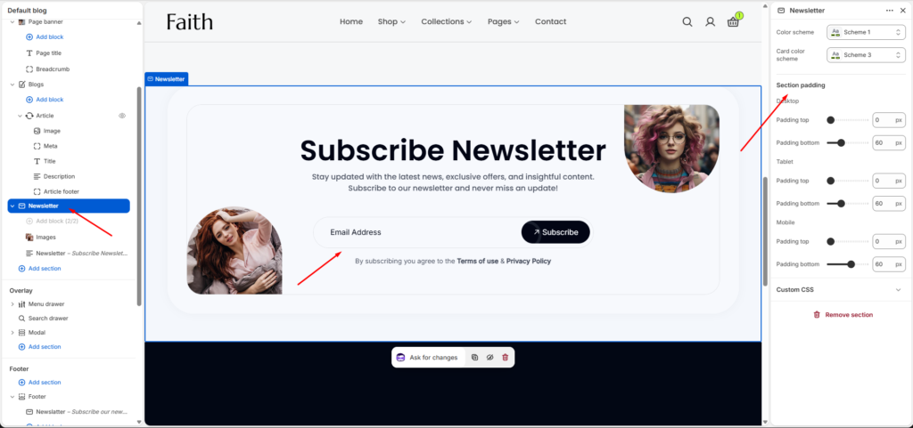
Newsletter Section
Select Newsletter section.
This section allows visitors to subscribe for updates.
Settings:
| Setting | Description |
|---|---|
| Color Scheme | Change newsletter background colors. |
| Card Color Scheme | Change inside card style. |
| Padding Top | Control upper spacing. |
| Padding Bottom | Control lower spacing. |
Newsletter Blocks
Available blocks:
Images
Upload decorative newsletter images.
Newsletter Form
Customize:
- Heading text
- Description
- Email input field
- Subscribe button
- Privacy text
Section Padding Settings
Adjust responsive spacing:
Desktop
- Padding top
- Padding bottom
Tablet
- Padding top
- Padding bottom
Mobile
- Padding top
- Padding bottom
Use these settings to create proper spacing on all devices.
Save Changes
After customization:
- Preview desktop view
- Check tablet/mobile layout
- Click Save
Your customized Blog page is ready.