How to Access the Split Card Section
- Go to Admin → Online Store → Themes
- Click Customize on your active theme
- Open the Home page template
- Search for and select the Split Card section
- Inside this section, you can customize:
- Section header
- Columns
- Feature cards
- Images
- Icons
- Text content
- Layout spacing
The Split Card section helps you display important store benefits, features, services, or promotional information in a clean card-based layout.
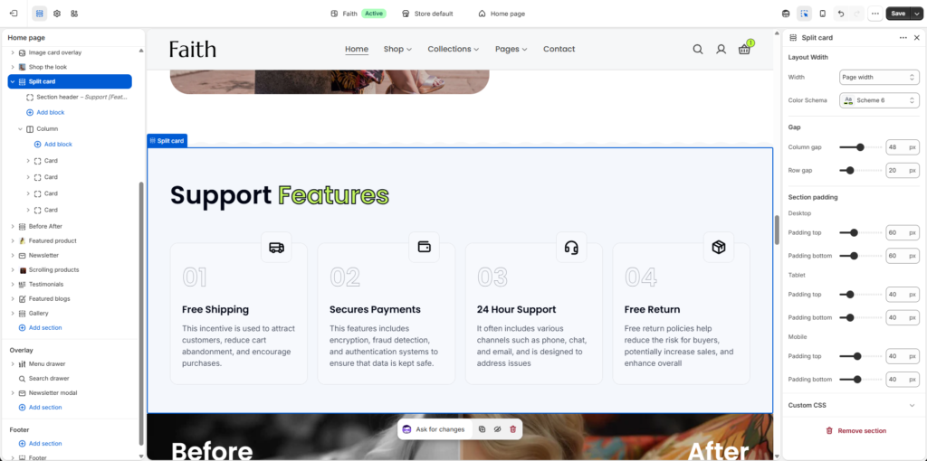
Split Card Section Settings
| Settings | Description |
|---|
| Width | Choose the section layout width. Available options include Page width and Full width. |
| Color Scheme | Select the color scheme for the entire section. |
| Column Gap | Adjust the horizontal spacing between columns. |
| Row Gap | Adjust the vertical spacing between rows/cards. |
| Padding Top | Control top spacing separately for Desktop, Tablet, and Mobile devices. |
| Padding Bottom | Control bottom spacing separately for Desktop, Tablet, and Mobile devices. |
| Custom CSS | Add custom CSS to apply advanced styling changes. |
Section Header Settings
Customize the heading area displayed above the cards.
| Settings | Description |
|---|
| Heading | Add the section title. Example: Support [Features]. |
| Heading Size | Select the heading size such as H1, H2, or available heading styles. |
| Text | Add additional description text below the heading. |
| Body Style | Choose between Body and Subtitle styles. |
| Caption Size | Adjust description size using Small, Medium, or Large options. |
| Alignment | Set the header position using Left, Center, or Right alignment. |
Column Settings
Columns allow you to organize image blocks and feature cards.
| Settings | Description |
|---|
| Add Block | Add new content blocks inside the column. |
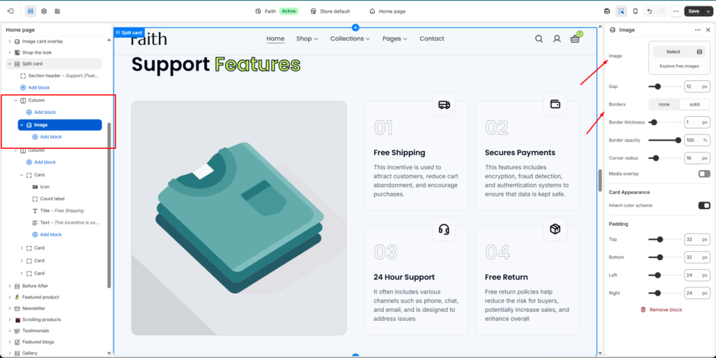
| Image Block | Display a large visual image inside the column layout. |
| Card Block | Add feature/service cards with custom content. |
| Column Layout | Arrange multiple cards and images in a flexible grid layout. |
Image Block Settings
Customize the image displayed inside the Split Card section.
| Settings | Description |
|---|
| Image | Upload or select an image. |
| Gap | Adjust spacing between image/card content. |
| Borders | Choose None or Solid border style. |
| Border Thickness | Adjust the image border thickness. |
| Border Opacity | Control the border transparency. |
| Corner Radius | Adjust rounded corners for the image. |
| Media Overlay | Enable an overlay effect on the image. |
| Inherit Color Scheme | Use the parent section color scheme. |
| Padding | Control image/card spacing from Top, Bottom, Left, and Right. |
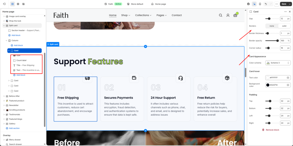
Card Block Settings
Customize each feature card individually.
| Settings | Description |
|---|
| Gap | Adjust spacing between card elements. |
| Borders | Enable or disable card borders. |
| Border Thickness | Adjust card border size. |
| Border Opacity | Control card border visibility. |
| Corner Radius | Adjust rounded card corners. |
| Color Scheme | Choose the card background and text color scheme. |
| Card Hover Text Color | Set the text color when hovering over the card. |
| Card Hover Background Color | Set the card background color when hovering. |
| Padding Top | Adjust card top inner spacing. |
| Padding Bottom | Adjust card bottom inner spacing. |
| Padding Left | Adjust card left spacing. |
| Padding Right | Adjust card right spacing. |
Card Content Settings
Each card contains customizable content blocks.
| Settings | Description |
|---|
| Icon | Select or upload an icon for the feature card. |
| Count Label | Add a number or label. Example: 01, 02, 03. |
| Title | Add the card heading. Example: Free Shipping. |
| Text | Add the card description/details. |
Remove Options
| Option | Description |
|---|
| Remove Block | Delete a selected image, card, or content block. |
| Remove Section | Delete the entire Split Card section from the page. |

