

The Announcement Bar is a promotional section displayed at the top of your storefront. It can be used to highlight offers, announcements, promotions, contact information, social media icons, and rotating announcement slides.
The section supports:
- Multiple announcement slides
- Auto-rotating content
- Social media icons
- Contact information
- Custom drawer backgrounds
- Navigation controls
- Responsive spacing settings
How to Access
Go to Admin → Online Store → Themes
- Click Customize on your active theme
- Open the Header group
- Select Announcement Bar
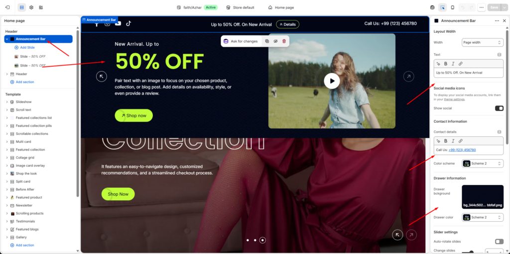
Layout Width
Controls the overall width of the announcement bar content.
Width
Available Options
| Option | Description |
|---|---|
| Page width | Matches the main website container width |
| Full width | Stretches across the entire screen |
Example
| Setting | Value |
|---|---|
| Width | Page width |
Announcement Text
Customize the main promotional message displayed inside the announcement bar.
Text
Supports rich text formatting such as:
- Bold
- Italic
- Links
Example
Up to 50% Off. On New ArrivalSocial Media Icons
Display social media icons directly inside the announcement bar.
Social links are managed from:
Theme Settings → Social mediaShow Social
Enables social media icons visibility.
Supported platforms may include:
- TikTok
- YouTube
- X / Twitter
Contact Information
Display store contact details inside the announcement bar.
Contact Details
Supports formatted rich text content.
Example
Call Us: +99 (123) 456780Color Scheme
Controls the appearance of the contact information area.
Example
| Setting | Value |
|---|---|
| Color scheme | Scheme 2 |
Drawer Information
Customize the slide-out announcement drawer appearance.
Drawer Background
Upload a custom background image for the drawer.
Supported Formats
- PNG
- JPG
- WEBP
- SVG
Example File
bg_344c502b-9e4f-497b-9fb8-64758fabbfaf.pngDrawer Color
Controls the drawer color scheme.
Example
| Setting | Value |
|---|---|
| Drawer color | Scheme 2 |
Slider Settings
The announcement bar supports multiple rotating slides.
Auto-Rotate Slides
Automatically changes announcement slides after a specified interval.
Change Slides Every
Controls slide rotation timing.
Example
| Setting | Value |
|---|---|
| Change slides every | 5 seconds |
Enable Loop
Continuously loops announcement slides.
Enable Pagination
Displays slide pagination indicators.
Example
- Dots
- Progress indicators
Enable Navigation
Displays previous/next navigation arrows.
Navigation Color
Controls navigation icon colors.
Example
| Setting | Value |
|---|---|
| Navigation color | Scheme 2 |
Section Padding
Adjust spacing around the announcement bar for different devices.
Desktop Padding
| Setting | Description |
|---|---|
| Padding top | Top spacing |
| Padding bottom | Bottom spacing |
Example
| Device | Top | Bottom |
|---|---|---|
| Desktop | 16px | 16px |
Tablet Padding
| Setting | Description |
|---|---|
| Padding top | Top spacing |
| Padding bottom | Bottom spacing |
Example
| Device | Top | Bottom |
|---|---|---|
| Tablet | 16px | 16px |
Mobile Padding
| Setting | Description |
|---|---|
| Padding top | Top spacing |
| Padding bottom | Bottom spacing |
Example
| Device | Top | Bottom |
|---|---|---|
| Mobile | 16px | 16px |
Slide Item Settings
Each announcement slide can contain custom promotional content.
Add Slide
Use the Add Slide option to create multiple announcement items.
Slide Content
Each slide may include:
- Promotional text
- Icons
- Links
- Buttons
- Social icons
- Custom styles
Slide Navigation
Slides can be:
- Manually navigated
- Auto-rotated
- Looped continuously
Multiple Slides
Example:
- Slide — 50% OFF
- Slide — Free Shipping
- Slide — New Arrival
Responsive Behavior
The announcement bar automatically adapts to:
- Desktop devices
- Tablets
- Mobile screens
Navigation and layout spacing adjust automatically for smaller screens.
Notes
- Social icons only appear if social links are configured.
- Auto-rotate requires multiple slides to function properly.
- Drawer background images are optional.
- Announcement slides can be reordered using drag-and-drop inside the theme editor.
- Color schemes inherit global theme colors unless customized separately.
Announcement Slide Settings
Each Announcement Bar slide can display promotional content using images, videos, text, buttons, and custom styling. Slides are fully customizable and support both image and video media types.
How to Access
Go to Admin → Online Store → Themes
- Click Customize on your active theme
- Open Header → Announcement Bar
- Select a Slide block
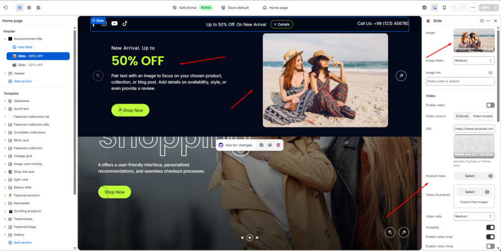
Media Settings
Slides support both images and videos.
Image Settings
Display a custom image inside the announcement slide.
Image
Upload an image for the slide.
Supported Formats
- JPG
- PNG
- WEBP
- SVG
Example File
announcement-image_08a16e63-32ef-4d06-8d96-574e3d6aeab8.jpgImage Ratio
Controls the displayed image size and proportions.
Available Options
| Option | Description |
|---|---|
| Small | Compact image display |
| Medium | Balanced image size |
| Large | Larger promotional image |
Example
| Setting | Value |
|---|---|
| Image Ratio | Medium |
Image Link
Add a clickable link to the slide image.
Example Uses
- Product pages
- Collections
- Promotional landing pages
- Blog posts
Video Settings
Display videos inside announcement slides.
Enable Video
Activates video support for the slide.
Video Source
Choose how the video is added.
Available Options
| Source | Description |
|---|---|
| External | Uses YouTube or Vimeo URL |
| Video hosted | Upload Shopify-hosted video |
External Video
Add a YouTube or Vimeo video URL.
Example
https://www.youtube.com/watch?v=_9VUPq3SxOcSupported Platforms
- YouTube
- Vimeo
Hosted Video
Upload or select a Shopify-hosted video.
Video Thumbnail
Upload a custom preview image shown before video playback.
Supported Formats
- JPG
- PNG
- WEBP
Video Ratio
Controls the video display size.
Available Options
| Option | Description |
|---|---|
| Small | Compact video layout |
| Medium | Balanced video size |
| Large | Large featured video |
Autoplay
Automatically starts video playback when the slide becomes visible.
Enable Video Loop
Continuously loops the video playback.
Enable Video Mute
Mutes video audio automatically.
This is commonly recommended when autoplay is enabled.
Hide Play Button
Hides the manual play icon overlay from the video.
Content Settings
Customize the promotional text displayed inside the slide.
Caption
Displays a small introductory label above the heading.
Example
New Arrival. Up toCaption Type
Controls caption text style.
Available Options
| Option | Description |
|---|---|
| Subtitle | Standard subtitle style |
| Uppercase | Fully uppercase styling |
Caption Size
Controls caption text size.
Example
| Setting | Value |
|---|---|
| Caption Size | Large |
Heading
Displays the main promotional title.
Example
50% OFFHeading Size
Controls heading typography size.
Available Options
| Option |
|---|
| H1 |
| H2 |
| H3 |
| H4 |
Example
| Setting | Value |
|---|---|
| Heading size | H2 |
Text Content
Displays supporting promotional text below the heading.
Example
Pair text with an image to focus on your chosen product, collection, or blog post. Add details on availability, style, or even provide a review.Body Style
Controls the text typography style.
Available Options
| Option |
|---|
| Body |
| Subtitle |
Text Size
Controls supporting text size.
Example
| Setting | Value |
|---|---|
| Caption Size | Medium |
Button Settings
Add a promotional call-to-action button.
Button Text
Customize the button label.
Example
Shop NowNotes
Leave blank to hide the button.
Button Link
Select where the button redirects customers.
Example
| Link |
|---|
| All Products |
Button Style
Controls the button appearance.
Available Options
| Option | Description |
|---|---|
| Primary | Main highlighted button |
| Secondary | Alternative button style |
Appearance Settings
Customize slide text colors.
Enable Color
Allows custom color overrides for the slide content.
Caption Color
Controls caption text color.
Example
| Element | Color |
|---|---|
| Caption | #FFFFFF |
Text Color
Controls paragraph text color.
Example
| Element | Color |
|---|---|
| Text | #FFFFFF |
Heading Color
Controls heading text color.
Example
| Element | Color |
|---|---|
| Heading | #BFFD3B |
Notes
- Videos support autoplay, looping, and muted playback.
- External videos require valid YouTube or Vimeo URLs.
- Buttons are hidden automatically when no button text is provided.
- Slides can contain either images, videos, or both depending on layout settings.
- Content alignment and layout responsiveness adjust automatically across devices.
- Multiple announcement slides can be reordered using drag-and-drop in the theme editor.