How to Access the Gallery Section
- Go to Admin → Online Store → Themes
- Click Customize on your active theme
- Open the Home page template
- Search for and select the Gallery section
- This section includes:
- Static gallery header
- Gallery cards
- Product information
- Images or videos
- Slider settings
The Gallery section is designed to showcase Instagram-style images, videos, featured products, and promotional content in a modern slider layout.
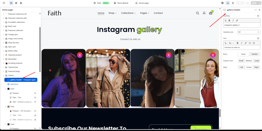
Gallery Header
The Gallery section includes a static header area where you can display a title and supporting text above the gallery slider.
| Settings | Description |
|---|
| Heading | Add the main gallery heading or section title. Example: Instagram gallery. |
| Heading Size | Select the heading size such as H1, H2, or other available heading styles. |
| Text | Add supporting text or short descriptions below the heading. |
| Body Style | Choose between Body or Subtitle text styles. |
| Caption Size | Adjust the text size using Small, Medium, or Large options. |
| Alignment | Control the alignment of the gallery header content using Left, Center, or Right alignment. |
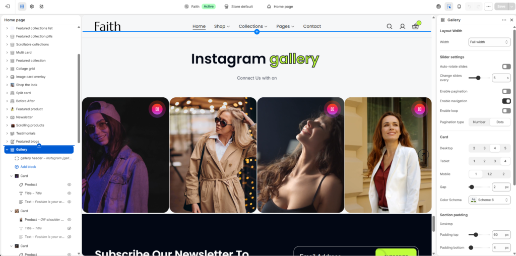
Gallery Section Settings
| Settings | Description |
|---|
| Width | Choose the gallery container width. Available options include Page width and Full width. |
| Auto-rotate Slides | Automatically rotate gallery slides after a specified duration. |
| Change Slides Every | Set the auto-slide transition timing in seconds. |
| Enable Pagination | Display pagination controls below the gallery slider. |
| Enable Navigation | Display previous and next navigation arrows for the slider. |
| Enable Loop | Continuously loop gallery slides. |
| Pagination Type | Select pagination style such as Number or Dots. |
| Desktop Items | Control how many gallery cards appear per row on desktop devices. |
| Tablet Items | Control how many gallery cards appear per row on tablet devices. |
| Mobile Items | Control how many gallery cards appear per row on mobile devices. |
| Gap | Adjust spacing between gallery cards and slider items. |
| Color Scheme | Select a predefined color scheme for the gallery section. |
| Padding Top | Add top spacing separately for Desktop, Tablet, and Mobile devices. |
| Padding Bottom | Add bottom spacing separately for Desktop, Tablet, and Mobile devices. |
| Custom CSS | Add custom CSS styles to further customize the gallery section appearance. |
Gallery Card Settings
| Settings | Description |
|---|
| Image | Upload an image for the gallery card. |
| Maximum Width | Control the maximum width of the image or media content. |
| Image Link | Add a custom link for the gallery image. |
| Enable Video | Enable video support inside the gallery card. |
| Video Source | Select the video source such as External URL or Uploaded video. |
| Video Upload | Upload or select a video file for the gallery card. |
| Autoplay | Automatically play the video when the slider loads. |
| Play Button Display | Control when the play button appears. |
| Play Button Style | Select the play button design style. |
| Play Button Alignment | Set the play button position on the media. |
| Image Ratio | Choose the media aspect ratio such as Portrait, Square, or other available options. |
| Media Overlay | Enable overlay styling on gallery media. |
| Product Block | Connect a product with the gallery card for promotional or shoppable gallery layouts. |
| Title Block | Add a custom title inside the gallery card. |
| Text Block | Add supporting text, captions, or promotional descriptions inside the card. |
| Responsive Layout | The gallery section automatically adjusts for desktop, tablet, and mobile devices. |

