


| Settings | Description |
| Slide height | Adapt to image: Uses the aspect ratio of the slider’s image then image size will be orginal size. Extra Small: This is the smallest height of the slider. Desktop height: 350px, Mobile height: 350px Small: This is the smallest height of the slider. Desktop height: 450px, Mobile height: 450px Medium: This is the medium height of the slider. Desktop height: 720px, Mobile height: 550px Large: This is the maximum height of the slider. Desktop height: 830px, Mobile height: 720px; Full-screen: Desktop height:100vh, Mobile height: 100vh; Custom: 1000px is the maximum height of the slider. Desktop height: you can set what size you want, Mobile height: mobile also you can set custom height. |
| Auto-rotate slides | A slide show can be set to play automatically. |
| Change slides every | Determine how frequently to update slides. Minimum 1s and maximum 10s |
| Show pagination | You can hide/show slider pagination bullet points. The bullet point will help you to present the specific slide. |
| Pagination style | Dots (default): If you select it, the pagination will be displayed as a bullet button. You can go to the next/prev slide by clicking the bullet points. Counter: If you select it, it will display the slider’s current slide position number and total slide count. e.g: 1/3 Numbers: If you select it, it will display the slider position/index number. You can go to the specific slide using the number pagination buttons. e.g: 1 2 3 |
| Pagination color | Navigation color will be apply for pagiation |
| Show navigation | You can hide/show slider navigation next/prev arrow button. You can go to the next/prev slide by clicking the next/prev buttons. |
| Hover background color | This is the navigation button hover background color. |
| Hover text color | This is the navigation button text hover color, |
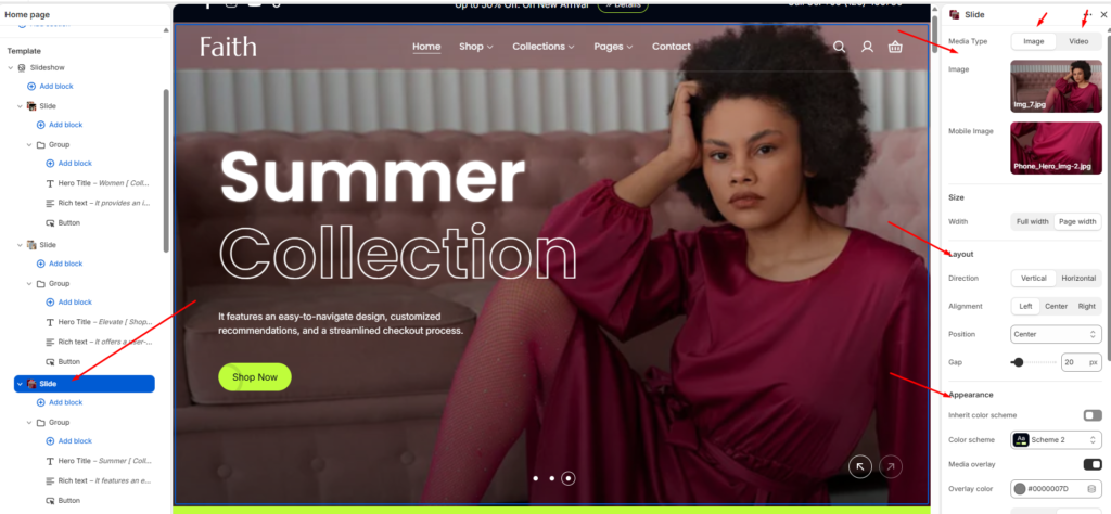
Slide block settings
| Settings | Description |
| Desktop image | This is the setting for your slide image. The recommended size is 1920 x 900px |
| Desktop Video | This is the setting for your slide video. The recommended size is 1920 x 900px |
| Hero title | RichText: You can add a slide title using the RichText editor. and For the featued text using this [featured text] |
| Hero title size | Extra Large: This is the large text size of the section heading. Desktop size: 120px, Mobile Size: 40px Large: This is the large text size of the section heading. Desktop size: 80px, Mobile Size:32px Medium: This is the medium text size of the section heading. Desktop size: 64px, Mobile Size: 24px Small: This is the medium text size of the section heading. Desktop size: 56px, Mobile Size: 20px |
| Richtext | You can add richtext for a single slide using the RichText editor. |
| Button label | This is a button for a single slide. Leave the label blank to hide the button. |
| Button link | This is a link for the button. |
| Button style | Primary: Use a solid background button style different color Secondary: Use a solid background button style different color |
| Button type | Default none, Button with icon & text. |
| Appearance | You can change color and also can add an overlay on the image from 0 to 100%. and you can set gradient overlary also. |
| Layout | There are two layout in settings once is vertical and another is horizontal. you can customise the aligment from this settings horizontally and vertically also |
| Content alignment | Left: Aligns the content to the left. Right: Aligns the content to the right. Center: Aligns the content to the center. |
| Text color | You can change text color of the slide. |
| Mobile image | This is the setting for your slide image on mobile. The recommended size is 600 x 480px |
| Mobile video | This is the setting for your slide video on mobile. The recommended size is 600 x 480px |
Section padding settings
| Settings | Description |
| Desktop: Padding top | The section’s top outer space height is determined. From 0 to 200 px, will be incremented by 5px. It will affect the desktop. |
| Desktop: Padding bottom | The section’s bottom outer space height is determined. From 0 to 200 px, will be incremented by 5px. It will affect the desktop. |
| Mobile: Padding top | The section’s top outer space height is determined. From 0 to 200 px, will be incremented by 5px. It will affect the mobile. |
| Mobile: Padding bottom | The section’s bottom outer space height is determined. From 0 to 200 px, will be incremented by 5px. It will affect the desktop. |