

Overview
The Accordion Item block allows you to create expandable and collapsible content areas for displaying information in a clean layout. It is commonly used for FAQs, product details, policies, and help sections.
How to use
- Go to Customize Theme.
- Open the section containing the accordion.
- Click Add block or select an existing Accordion Item block.
- Add your question or heading in the Title field.
- Add your answer/content inside the accordion content blocks.
- Choose an icon and collapse style.
- Customize spacing, radius, and colors.
- Click Save.
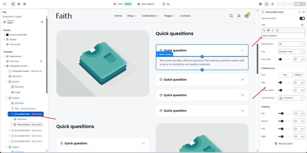
Accordion Item Block Documentation
| Settings | Description |
|---|---|
| Open by Default | Enable this option to keep the accordion item expanded when the page loads. |
| Title | Add the accordion question or heading text displayed in the accordion header. |
| Heading Size | Select the title heading size style for the accordion item. |
| Icon | Choose an icon to display beside the accordion title. Example: Question mark icon. |
| Icon Width | Adjust the size/width of the selected accordion icon. |
| Collapse Icon | Select the expand and collapse indicator style. Options include Plus and Arrow. |
| Gap | Control the spacing between accordion elements. |
| Corner Radius | Adjust the rounded corners of the accordion item container. |
| Color Scheme | Choose the color style applied to the accordion item. |
| Padding Top | Adjust the top spacing inside the accordion item. |
| Padding Bottom | Adjust the bottom spacing inside the accordion item. |
| Padding Left | Adjust the left side spacing inside the accordion item. |
| Padding Right | Adjust the right side spacing inside the accordion item. |