

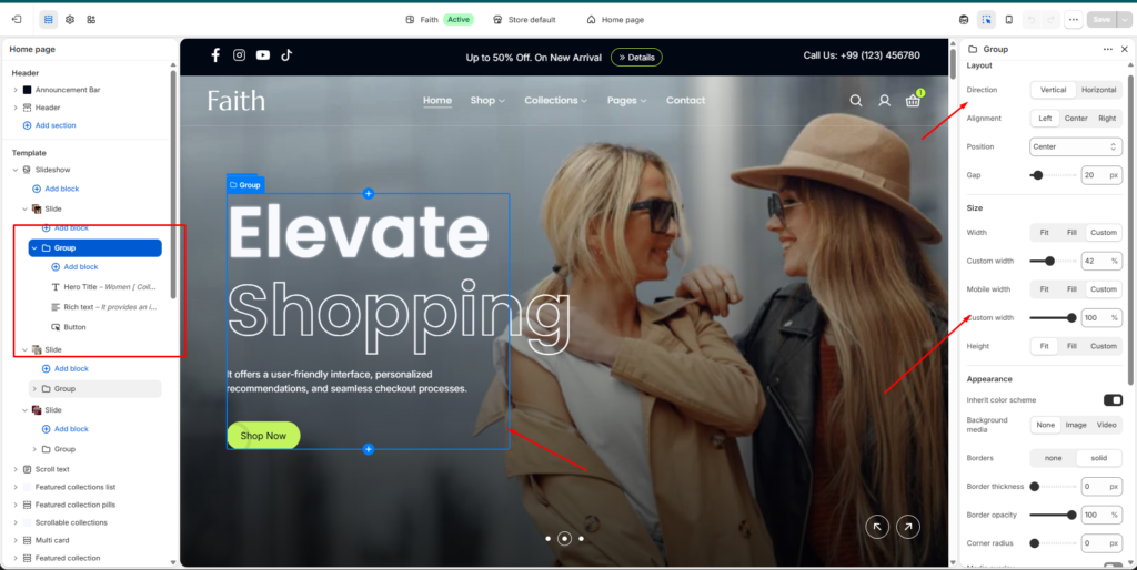
Group Block Settings
| Settings | Description |
|---|---|
| Direction | Choose the content direction inside the group. Available options include Vertical and Horizontal. |
| Alignment | Set the alignment of group content. Available options include Left, Center, and Right. |
| Position | Adjust the placement position of the group content inside the section. |
| Gap | Control the spacing between all blocks inside the group. |
| Width | Set the group width. Available options include Fit, Fill, and Custom. |
| Custom Width | Adjust the custom width percentage for desktop devices. |
| Mobile Width | Set the group width behavior on mobile devices. Available options include Fit, Fill, and Custom. |
| Mobile Custom Width | Adjust the custom width percentage for mobile devices. |
| Height | Control the group height. Available options include Fit, Fill, and Custom. |
| Inherit Color Scheme | Automatically use the parent section color scheme. |
| Background Media | Add background content inside the group. Available options include None, Image, and Video. |
| Borders | Enable or disable group borders. Available options include None and Solid. |
| Border Thickness | Adjust the thickness of the group border. |
| Border Opacity | Control the transparency level of the border. |
| Corner Radius | Adjust rounded corners for the group container. |
| Media Overlay | Add an overlay effect over the background media. |
| Link | Add a custom link to make the group clickable. |
| Open Link In New Tab | Enable the link to open in a new browser tab. |
| Padding | Adjust spacing inside the group using Top, Bottom, Left, and Right controls. |
The Group block allows you to organize multiple content blocks together such as headings, text, buttons, images, or other elements. You can control layout direction, spacing, size, background, borders, and responsive appearance.