| Width | Choose the content width for the Contact form section. Available options include Page width and Full width. |
| Column Gap | Adjust the horizontal spacing between form columns and content blocks. |
| Row Gap | Control the vertical spacing between form fields and rows. |
| Color Scheme | Select a predefined color scheme that matches your store branding and design style. |
| Padding Top | Add top spacing for the section separately for Desktop, Tablet, and Mobile devices. |
| Padding Bottom | Add bottom spacing for the section separately for Desktop, Tablet, and Mobile devices. |
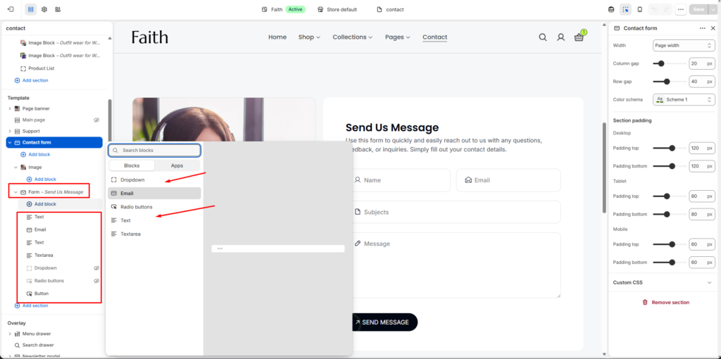
| Add Block | Dynamically add new form fields and content blocks inside the Contact form section. |
| Text Field | Add a standard single-line text input field for collecting user information such as name or subject. |
| Email Field | Add an email input field with email validation support. |
| Textarea Field | Add a multi-line message field for longer customer inquiries or feedback. |
| Dropdown Field | Add selectable dropdown options for users to choose predefined values. |
| Radio Buttons | Display multiple selectable options where users can choose a single option. |
| Button Block | Add a submit or action button for form submission. |
| Dynamic Fields | The Contact form supports dynamically adding and organizing multiple custom fields based on your business requirements. |
| Custom CSS | Add custom CSS styles to further customize the appearance and layout of the Contact form section. |
