

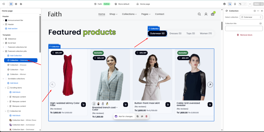
How to Access the Featured Collection Pills Section
- Go to Admin → Online Store → Themes
- Click Customize on your active theme
- Open the Home page template
- Find and select the Featured Collection Pills section
From here, you can customize:
- Section heading
- Collection tabs
- Product display
- Product grid layout
- Quick add button
- Slider controls
- Colors and spacing
The Featured Collection Pills section allows you to showcase products from multiple collections with interactive collection tabs. Customers can easily switch between different collections and browse featured products directly from the section.
Section Settings
| Settings | Description |
|---|---|
| Width | Choose the container width for the Featured Collection Pills section. Available options include Page width and Full width. |
| Heading | Add the main section heading/title for the collection showcase area. |
| Heading Size | Adjust the heading size according to your store design. |
| Text | Add description or promotional content below the heading. |
| Caption Size | Control the description text size. |
| Text Alignment | Align section content to Left, Center, or Right. |
| Color Scheme | Select a predefined color scheme to match your store branding and design style. |
| Maximum Products To Show | Set how many products will display from selected collections. |
| Desktop Columns | Choose the number of product columns displayed on desktop devices. |
| Tablet Columns | Adjust product columns for tablet screen sizes. |
| Mobile Columns | Control product layout for mobile devices. |
| Image Ratio | Select product image display ratio. |
| Show Secondary Image | Display another product image when hovering over a product card. |
| Show Vendor | Show product vendor or brand information. |
| Show Rating | Display product rating and review information. |
| Enable Quick Add | Allow customers to quickly add products to cart. |
| Button Style | Choose quick add button style such as Primary or Secondary. |
| Button Type | Select quick add button display type. |
| Auto Rotate Slides | Enable automatic product slider movement. |
| Change Slides Every | Set the time interval between automatic slide changes. |
| Enable Loop | Allow the slider to repeat continuously. |
| Enable Pagination | Show slider pagination controls. |
| Enable Navigation | Display slider next and previous arrows. |
| Navigation Color | Choose navigation button color style. |
| Padding Top | Add top spacing separately for Desktop, Tablet, and Mobile devices. |
| Padding Bottom | Add bottom spacing separately for Desktop, Tablet, and Mobile devices. |
| Custom CSS | Add custom CSS styles to customize section design and spacing. |
Collection Item Settings
| Settings | Description |
|---|---|
| Add Collection | Add multiple collection tabs inside the Featured Collection Pills section. |
| Select Collection | Choose which Shopify collection products will be displayed. |
| Collection Title | Add a custom title/name for the collection tab. |
| Collection Tab | Display clickable tabs so customers can switch between different collections. |
| Product Display | Automatically shows products from the selected collection. |
| Remove Block | Remove a specific collection item from the section. |