

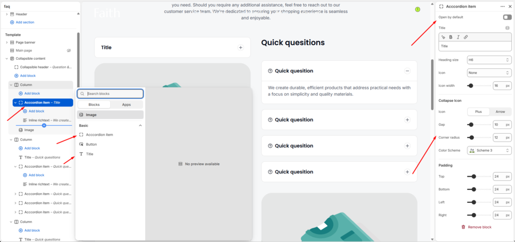
Accordion Item Block Settings
| Settings | Description |
|---|---|
| Open By Default | Enable the accordion item to stay expanded when the page loads. |
| Title | Add the accordion question or heading text. |
| Heading Size | Choose the size of the accordion title heading. |
| Icon | Select an icon to display beside the accordion title. |
| Icon Width | Adjust the size of the selected icon. |
| Collapse Icon | Choose the collapse style. Available options include Plus and Arrow. |
| Gap | Adjust the spacing between accordion elements. |
| Corner Radius | Customize the rounded corners of the accordion item. |
| Color Scheme | Select a predefined color scheme for the accordion design. |
| Padding | Adjust spacing inside the accordion using Top, Bottom, Left, and Right controls. |
The Accordion Item block allows you to create expandable content areas such as FAQs, product details, policies, or additional information. Customers can click each item to expand or collapse the content for a cleaner browsing experience.