| Width | Choose the content container width for the Collapsible content section. Available options include Page width and Full width. |
| Gap | Adjust the spacing between columns, accordion items, and content blocks. |
| Color Scheme | Select a predefined color scheme to match your store branding and overall design. |
| Padding Top | Add top spacing for the section separately for Desktop, Tablet, and Mobile devices. |
| Padding Bottom | Add bottom spacing for the section separately for Desktop, Tablet, and Mobile devices. |
| Add Block | Dynamically add new blocks inside the Collapsible content section. |
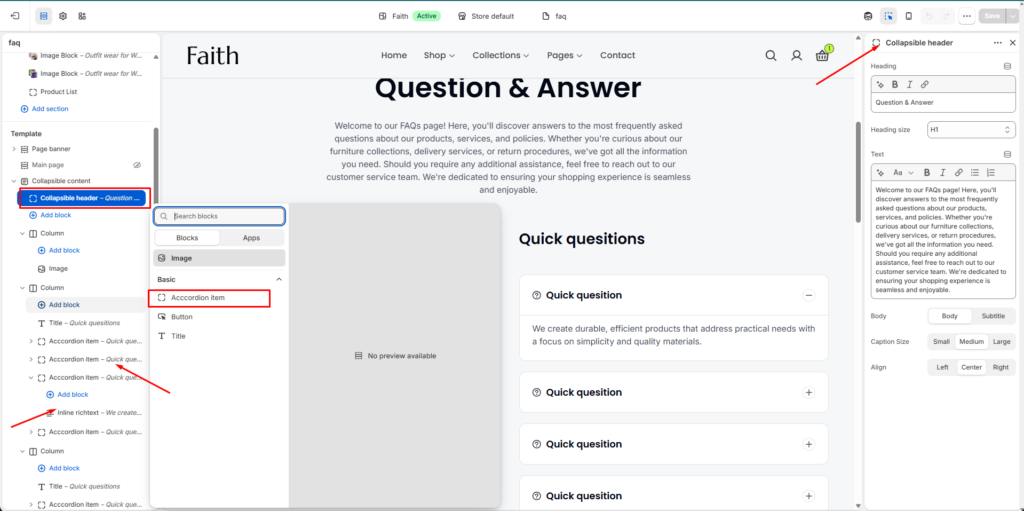
| Collapsible Header | Add a section heading and description content for the FAQ or collapsible area. |
| Heading | Add the main title for the collapsible content section. |
| Heading Size | Select the heading size such as H1, H2, or other available heading styles. |
| Text | Add supporting paragraph or description text below the heading. |
| Body Style | Choose between Body or Subtitle text styles for the description content. |
| Caption Size | Adjust the text size using Small, Medium, or Large options. |
| Alignment | Control the content alignment with Left, Center, or Right positioning. |
| Accordion Item | Add expandable FAQ or collapsible content items. Users can click to expand or collapse the content. |
| Inline Richtext | Add additional rich text content inside an accordion item for enhanced descriptions or formatted content. |
| Image Block | Add images inside the collapsible content section to create more engaging layouts. |
| Button Block | Add buttons for navigation, links, or call-to-action purposes. |
| Column Layout | Organize content into multiple columns for structured FAQ or informational layouts. |
| Custom CSS | Add custom CSS styles to further customize the appearance and spacing of the section. |
