

How to Access the Image Card Overlay Section
- Go to Admin → Online Store → Themes
- Click Customize on your active theme
- Open the Home page template
- Find and select the Image Card Overlay section
From here, you can customize:
- Section heading
- Promotional card
- Image overlay cards
- Slider controls
- Card items display
- Background image
- Colors and spacing
The Image Card Overlay section allows you to showcase promotional content, featured categories, or collections using image-based cards with overlay text and buttons. Customers can browse multiple cards in a slider layout with an attractive visual presentation.
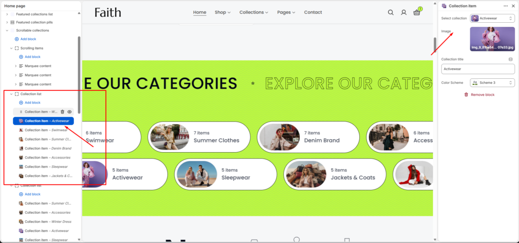
Image Card Overlay Section Settings
| Settings | Description |
|---|---|
| Width | Choose the container width for the Image Card Overlay section. Available options include Page width and Full width. |
| Color Scheme | Select a predefined color scheme to match your store branding and design style. |
| Auto Rotate Slides | Enable automatic sliding between image cards. |
| Change Slides Every | Set the time duration for automatic slide changes. |
| Enable Pagination | Show slider pagination controls. |
| Enable Navigation | Display next and previous slider navigation arrows. |
| Enable Loop | Allow the slider to continuously repeat items. |
| Pagination Type | Choose pagination style such as Number or Dots. |
| Desktop Card Item | Set the number of cards displayed on desktop devices. |
| Tablet Card Item | Adjust the number of cards displayed on tablet devices. |
| Mobile Card Item | Control how many cards appear on mobile devices. |
| Padding Top | Add top spacing for the section separately for Desktop, Tablet, and Mobile devices. |
| Padding Bottom | Add bottom spacing for the section separately for Desktop, Tablet, and Mobile devices. |
| Custom CSS | Add custom CSS styles to further customize the section appearance and spacing. |
Card Item Settings
| Settings | Description |
|---|---|
| Add Block | Add multiple image overlay cards inside the section. |
| Image | Upload or select an image for the card background. |
| Count Number | Add a custom number label or counter text on the card. |
| Title | Add the main card heading or promotional title. |
| Inline Richtext | Add short descriptions or formatted text content inside the card. |
| Button | Add a call-to-action button with custom text and link. |
| Promo Card | Add a highlighted promotional card with background image, text, and button. |
| Background Image | Upload a background image for the promo card design. |
| Image Alt Text | Add alternative text for accessibility and SEO. |
| Color Scheme | Select individual card color styling. |
| Remove Block | Remove a selected card item from the section. |