

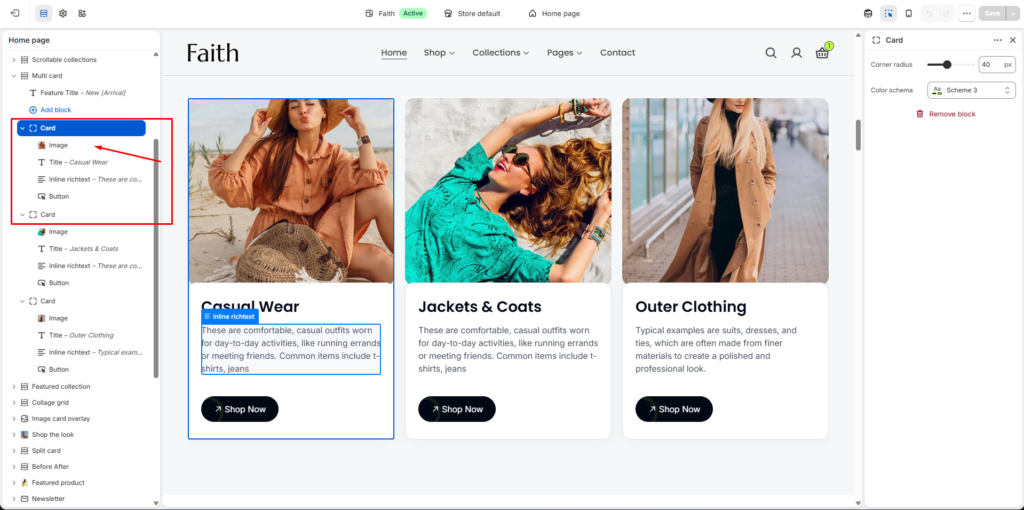
How to Access the Multi Card Section
Go to Admin → Online Store → Themes
Click Customize on your active theme
Open the Home page template
Find and select the Multi Card section
From here, you can customize:
- Section heading
- Multiple content cards
- Card images
- Card title and text
- Button content
- Slider controls
- Card layout
- Colors and spacing
The Multi Card section allows you to showcase multiple promotional cards with images, text, and call-to-action buttons. It is useful for highlighting collections, categories, offers, or featured content in a clean card-based layout.
Multi Card Section Settings
| Settings | Description |
|---|---|
| Width | Choose the container width for the Multi Card section. Available options include Page width and Full width. |
| Color Scheme | Select a predefined color scheme to customize the section background and styling. |
| Auto-rotate Slides | Enable automatic sliding between cards. |
| Change Slides Every | Adjust the time interval between automatic slide transitions. |
| Enable Loop | Allow the slider to continuously repeat after the last item. |
| Enable Pagination | Show pagination indicators for navigating between slides. |
| Enable Navigation | Display slider navigation arrows. |
| Pagination Type | Choose the pagination style such as Number or Dots. |
| Desktop Card Item | Set how many cards display per row on desktop devices. |
| Tablet Card Item | Set how many cards display per row on tablet devices. |
| Mobile Card Item | Set how many cards display per row on mobile devices. |
| Padding Top | Adjust top spacing separately for Desktop, Tablet, and Mobile devices. |
| Padding Bottom | Adjust bottom spacing separately for Desktop, Tablet, and Mobile devices. |
| Add Block | Add multiple card items inside the section. |
| Custom CSS | Add custom CSS styles to customize the section appearance. |
Header Settings
| Settings | Description |
|---|---|
| Heading | Add or edit the main heading text displayed above the cards. |
| Heading Size | Choose the heading size style. |
| Text Alignment | Control heading alignment such as Left, Center, or Right. |
| Color Scheme | Select a color style for the heading area. |
Card Item Settings
| Settings | Description |
|---|---|
| Image | Upload an image for the card. |
| Title Block | Add a card title to highlight categories, products, or promotions. |
| Inline Richtext | Add short descriptions or supporting text inside the card. |
| Button Block | Add a call-to-action button with a custom link. |
| Corner Radius | Adjust the card border radius for rounded corners. |
| Color Scheme | Select a predefined color scheme for individual cards. |