
The Header section is designed to provide a modern, responsive, and feature-rich navigation experience for Shopify stores. It includes logo positioning controls, menu customization, sticky behavior, transparent header options, mega menu support, promotional content blocks, and responsive layout settings.
Header Settings
| Settings | Description |
|---|---|
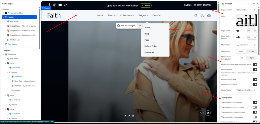
| Logo Position | When a customer views the site on a large screen, such as a desktop computer, the logo appears in the header. Left – Classic layout with logo on the left Center – Logo centered while the menu aligns to the left. Top– Logo on top with navigation menu placed below it. Menu center, – Clean design with centered menu. |
| Logo | Upload your store logo through Section Settings > Logo Logo appears on all pages by default |
| Logo Width | Adjusts the desktop logo width for better branding visibility and responsive layout control. |
| Logo Width – Mobile | Allows separate logo sizing for mobile devices to improve responsiveness. |
| Main Menu | Select the Shopify navigation menu displayed inside the header section. |
| Menu Type | Controls how navigation links appear. Inline displays links directly in the header, while Drawer shows them inside a slide-out menu. |
| Mobile Menu Icon Position | Controls the placement of the mobile menu icon. Available positions are Left and Right. |
| Enable First Level Links Dropdown Arrow | Displays dropdown indicators beside menu items that contain submenus. |
| Enable Search | Enables the search icon and search functionality inside the header. Search box – Displays a visible search bar directly in the header. Search popup – Opens a popup drawer when the search icon is clicked. |
| Show cart icon | Enable/disable cart access (disabling removes cart functionality) |
| Show user icon | Toggle account/login icon visibility |
| Enable Bottom Line | Displays a bottom border line below the header section. |
| Enable Sticky Header | Keeps the header visible while scrolling through the page. |
| Sticky Mode | Controls sticky header behavior such as Always Visible, Visible on Scroll Up, or Visible on Scroll Down. |
| Transparent Header | Enables transparent header only on the homepage. Enables transparent header on product pages. Enables transparent header on collection pages. Enables transparent header on search result pages. Applies transparent header across the entire website. |
| Transparent Logo | Upload a separate logo version optimized for transparent header layouts. |
| Links and Text Color | Controls menu links and icon colors while the transparent header is enabled. |
| Margin Bottom | Controls spacing below the header section. |
| Color Scheme | Selects the overall header color scheme. |
| Menu Color | Controls navigation menu color styling independently from the header. |
| Transparent Header Text Color | Controls text and icon color when the transparent header is active. |
| Sticky Header Background | Controls sticky header background color during scroll. |
| Sticky Header Text Color | Controls sticky header text and icon colors during sticky mode. |
| Desktop Padding | Adjusts top and bottom spacing for desktop devices. |
| Tablet Padding | Adjusts top and bottom spacing for tablet devices. |
| Mobile Padding | Adjusts top and bottom spacing for mobile devices. |
Mega Menu Settings
| Settings | Description |
|---|---|
| Link Position in Main Menu | Assigns the mega menu content block to a specific main menu item. |
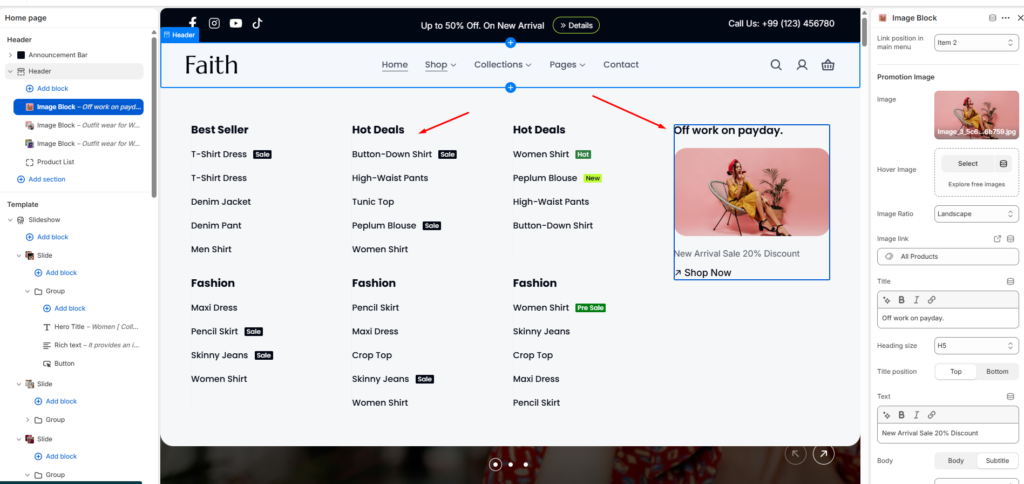
| Promotion Image | Upload promotional images displayed inside the mega menu dropdown. |
| Hover Image | Upload an alternate image displayed when hovering over the promotional image. |
| Image Ratio | Controls image aspect ratio such as Portrait, Landscape, or Square. |
| Image Link | Assigns a destination URL to the promotional image. |
| Title | Adds promotional image heading text inside the mega menu. |
| Heading Size | Controls the title heading size from H1 to H5. |
| Title Position | Controls whether the title appears at the top or bottom of the image block. |
| Text Content | Adds promotional description or marketing text below the title. |
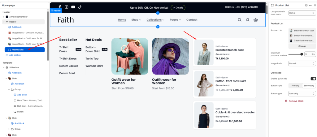
| Product List | Displays selected featured products inside the mega menu dropdown. |
| Maximum Products to Show | Controls how many featured products appear in the mega menu. |
| Enable Quick Add | Enables quick add-to-cart functionality directly from the mega menu. |
| Button Style | Controls quick add button appearance such as Primary or Secondary style. |
| Button Type | Controls button appearance including Icon Only or Icon & Text styles. |
Promotion Image
Product List