

The Collection Filter system allows customers to quickly filter and sort products within collection pages. Filters are powered by Shopify’s Search & Discovery app and support filtering by product type, category, color, size, price, availability, and more.
The filter section can be displayed in either Vertical Sidebar or Horizontal Toolbar layouts.
How to Access
Theme Editor Settings
Go to Admin → Online Store → Themes
- Click Customize on your active theme
- Open a Collection template
- Select Main collection → Filter
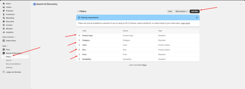
Shopify Search & Discovery Filters
Filters are managed through Shopify’s Search & Discovery app.
Go to:
Shopify Admin → Apps → Search & Discovery → FiltersAvailable Filter Types
The theme supports Shopify filter sources such as:
| Filter | Type |
|---|---|
| Product type | Standard |
| Category | Standard |
| Color | Product option |
| Size | Product option |
| Price | Standard |
| Availability | Standard |
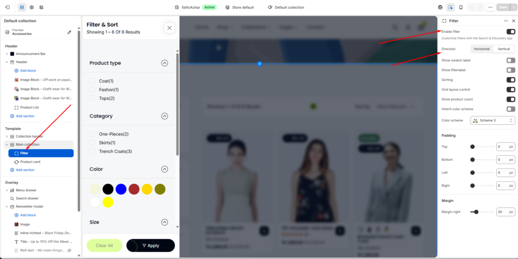
Enable Filter
Activates collection filtering on collection pages.
When enabled, customers can:
- Filter products dynamically
- Narrow search results
- Sort collection products
- Change product grid layout
Filter Direction
Choose how filters appear on the collection page.
Vertical Filter
Displays filters inside a sidebar or drawer layout.
Features
- Expandable accordion filters
- Mobile-friendly filter drawer
- Sticky sidebar support
- Apply & Clear buttons
Best For
- Large catalogs
- Fashion stores
- Multi-category collections
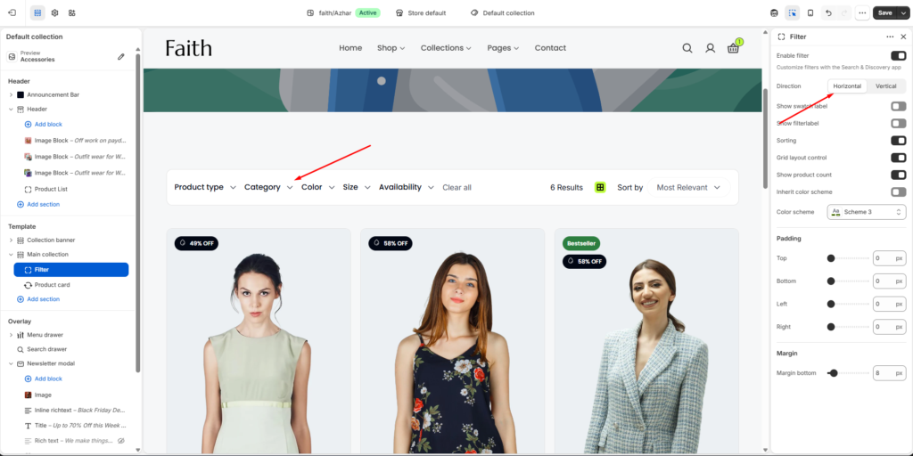
Horizontal Filter
Displays filters in a horizontal toolbar above the product grid.
Features
- Compact layout
- Quick-access dropdown filters
- Inline sorting controls
- Minimal spacing usage
Best For
- Smaller collections
- Minimal storefront designs
- Faster product browsing
Filter Display Settings
Show Swatch Label
Displays labels for color swatches.
Example
| Swatch | Label |
|---|---|
| Red circle | Red |
| Blue circle | Blue |
Show Filter Label
Displays filter section titles.
Example:
- Product type
- Category
- Color
- Size
Sorting
Enable Sorting
Displays sorting options on collection pages.
Customers can sort products by:
- Most Relevant
- Best Selling
- Price: Low to High
- Price: High to Low
- Alphabetically
- Newest
Grid Layout Control
Enable Grid Layout Control
Allows customers to switch between different product grid layouts.
Example Layouts
- 2-column grid
- 3-column grid
- 4-column grid
- List view
Show Product Count
Displays the number of products matching selected filters.
Example
Showing 1–6 of 6 ResultsColor Settings
Customize filter section colors.
Inherit Color Scheme
Uses the parent section color scheme automatically.
Color Scheme
Choose a custom color scheme for the filter section.
Example
| Setting | Value |
|---|---|
| Color scheme | Scheme 3 |
Padding Settings
Adjust spacing around the filter section.
Available Padding Controls
| Setting | Description |
|---|---|
| Top | Top spacing |
| Bottom | Bottom spacing |
| Left | Left spacing |
| Right | Right spacing |
Example
| Setting | Value |
|---|---|
| Top | 0px |
| Bottom | 0px |
| Left | 0px |
| Right | 0px |
Margin Settings
Control spacing outside the filter section.
Margin Controls
| Setting | Description |
|---|---|
| Margin right | Right outer spacing |
| Margin bottom | Bottom outer spacing |
Example
| Setting | Value |
|---|---|
| Margin bottom | 8px |
Mobile Filter Drawer
On mobile devices, filters appear inside a slide-out drawer for better usability.
Mobile Features
- Accordion filter groups
- Apply button
- Clear all button
- Scrollable filter content
- Touch-friendly interactions
Supported Filter Sources
Filters work automatically with:
- Product options
- Product tags
- Product types
- Availability
- Price ranges
- Shopify categories
- Variant options
Search & Discovery App Notes
The filter system relies on Shopify’s Search & Discovery app.
Important
- Filters must be configured in the app before appearing on storefront collections.
- OS 2.0 themes are required for advanced filtering.
- Product option filters require consistent variant naming.
Example
For color filtering:
Red, Blue, Black, WhiteFor size filtering:
S, M, L, XLNotes
- Filter appearance may vary between desktop and mobile layouts.
- Horizontal filters provide a compact browsing experience.
- Vertical filters are recommended for stores with large product catalogs.
- Some filter types depend on Shopify product data structure.
- Filters update automatically based on available products in the current collection.