Customize tab items, icons, content, layout, colors, and spacing
The Product Tab Content section allows you to display extra product information using organized tabs such as description, specifications, shipping details, size information, or custom content.
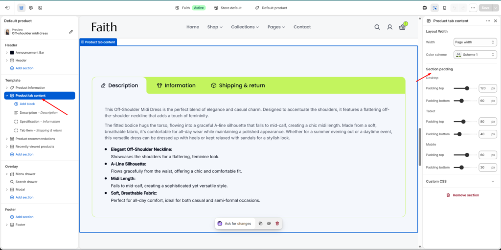
Product Tab Content Section Settings
Settings
Description
Width
Adjust the section container width. Example: Page width.
Color Scheme
Select the color scheme for the product tab section.
Desktop Padding Top
Controls the top spacing of the section on desktop devices.
Desktop Padding Bottom
Controls the bottom spacing of the section on desktop devices.
Tablet Padding Top
Controls the top spacing on tablet devices.
Tablet Padding Bottom
Controls the bottom spacing on tablet devices.
Mobile Padding Top
Controls the top spacing on mobile devices.
Mobile Padding Bottom
Controls the bottom spacing on mobile devices.
Custom CSS
Add custom CSS styles for additional design customization.
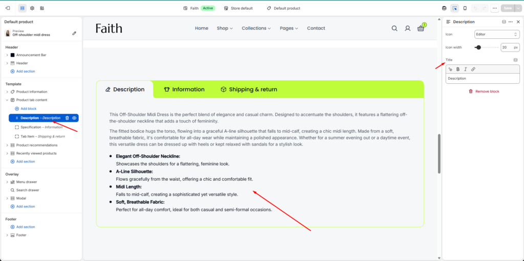
Description Block Settings
Settings
Description
Icon
Choose an icon for the description tab heading.
Icon Width
Adjust the size of the tab icon.
Title
Add or edit the tab title text. Example: Description.
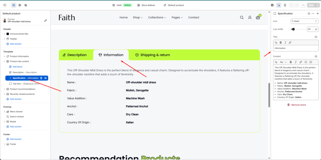
Specification Block Settings
Settings
Description
Icon
Select an icon for the specification tab.
Icon Width
Adjust specification tab icon size.
Title
Add the specification tab heading.
Content
Add custom product details, features, materials, care instructions, or other information using the rich text editor.
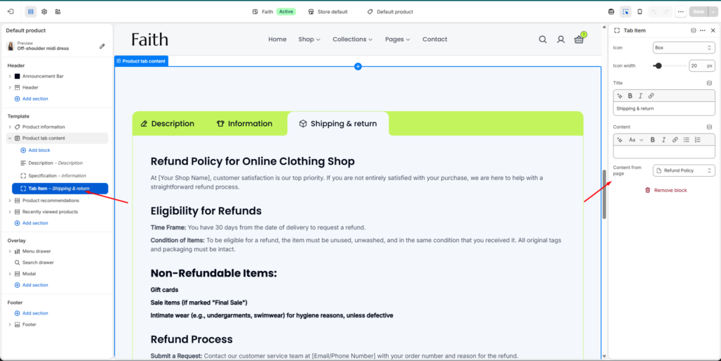
Tab Item Block Settings
Settings
Description
Icon
Select the tab item icon.
Icon Width
Control the tab icon display size.
Title
Add the tab title text.
Content
Add custom content manually using the editor.
Content From Page
Connect an existing Shopify page to display its content automatically inside the tab.
Example Uses
Product description
Product specifications
Material details
Size guide information
Shipping & return policy
Care instructions
Warranty details
Customers can switch between tabs to quickly view different product information without leaving the product page.
