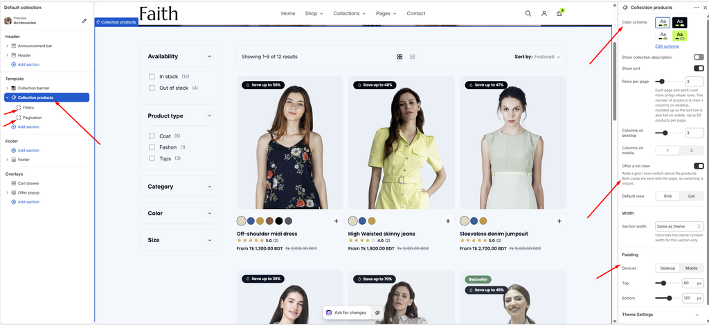
The Collection products section is the main product grid on every collection page. It shows the collection’s products with filters, sorting, a product count, and an optional grid or list view switch. You choose how many columns and rows to show, and how customers load more products. The products appear as Product cards, styled in Theme settings → Product cards. The section has two parts: Filters and Pagination. Both are part of the section and cannot be removed.
How to use
Go to Online Store → Themes → Customize.
From the page selector at the top, choose Collections → Default collection.
Select Collection products.
Choose the Color scheme, and whether to show the collection description and sort.
Set the Rows per page, Columns on desktop and Columns on mobile.
Turn on Offer a list view if you want a grid or list switch, and choose the Default view.
Set the Section width and Padding.
Select Filters and Pagination to set them up.
Click Save.
Settings
Settings
Description
Color Scheme
Select a predefined color scheme for the section.
Show Collection Description
Show the collection description above the products. Turn this off if the description already appears in the Collection banner.
Show Sort
Show the Sort by menu, so customers can sort by featured, best selling, price, name or date.
Rows Per Page
Set how many rows of products load per page, and each time Load more is used (1–12). The number of products is rows × columns on desktop, rounded up so the last row is also full on mobile. Up to 50 products per page.
Columns on Desktop
Set how many products show in each row on desktop (2–5).
Columns on Mobile
Set how many products show in each row on mobile: 1 or 2.
Offer a List View
Add a grid or list switch above the products. Both views load with the page, so switching is instant.
Default View
Appears when Offer a list view is on. Choose the view customers see first: Grid or List.
Section Width
Set how wide the section is: Same as theme, Full width, Wide, Standard, Narrow or Custom. This overrides the theme Content width for this section only.
Custom Section Width
Appears when Section width is Custom. Set an exact width (600–2000 px).
Padding
Choose Desktop or Mobile under Devices, then adjust the Top and Bottom spacing of the section for that device.
Tip: With 3 columns and 3 rows, each page shows 9 products. For faster pages, keep it under 24 products per page, and let Load more or Infinite scroll bring the rest.
Product cards: Card style, image ratio, quick add, swatches and badges are set in Theme settings → Product cards and Product badges. See the Product Card and Product Badges articles.
Filters Block
Overview
The Filters block lets customers narrow the products by availability, price, product type, vendor, color, size and more. Filters show in a sidebar beside the products, or in a drawer that opens from a Filter button. On mobile, filters always open in a drawer. This block is part of the section and cannot be removed.
How to use
Expand Collection products and select Filters.
Turn on Show filters.
Choose the Filter layout on desktop: Sidebar or Drawer.
Optionally, turn off Inherit color scheme and choose a different color scheme.
Click Save.
To choose which filters appear, install Shopify’s free Search & Discovery app, then go to Search & Discovery → Filters → Add filter.
Settings
Settings
Description
Show Filters
Show product filters on the collection page.
Filter Layout on Desktop
Appears when Show filters is on. Choose Sidebar (always visible beside the products) or Drawer (opens from a Filter button, giving the products the full width). On mobile, filters always open in a drawer.
Inherit Color Scheme
Use the section’s colors. Turn this off to give the filters their own color scheme.
Color Scheme
Appears when Inherit color scheme is off. Select the filters’ color scheme.
Setting up filters: The filter list (Availability, Price, Product type, Color, Size and so on) is managed in the Search & Discovery app, not in the theme. Add the filters you need there, and drag them into the order you want. Color filters show as swatches when you set up colors in Theme settings → Swatches or with Shopify’s category metafields.
Pagination Block
Overview
The Pagination block controls how customers see more products: numbered pages, a Load more button, or infinite scroll. This block is part of the section and cannot be removed.
How to use
Expand Collection products and select Pagination.
Choose the Pagination type.
Adjust the Padding, and optionally the color scheme.
Click Save.
Settings
Settings
Description
Pagination
Choose how more products load: Page numbers, Load more button or Infinite scroll. Infinite scroll loads the next page as the customer nears the end of the grid. Page links stay in the page code for search engines and for browsers without JavaScript.
Padding
Choose Desktop or Mobile under Devices, then adjust the Top, Bottom, Left and Right spacing of the block for that device (0–100 px).
Inherit Color Scheme
Use the section’s colors. Turn this off to give the pagination its own color scheme.
Color Scheme
Appears when Inherit color scheme is off. Select the pagination’s color scheme.
Tip:Load more button works well for most stores: customers stay in control and can still reach the footer. Use Infinite scroll for large catalogs where customers mostly browse.